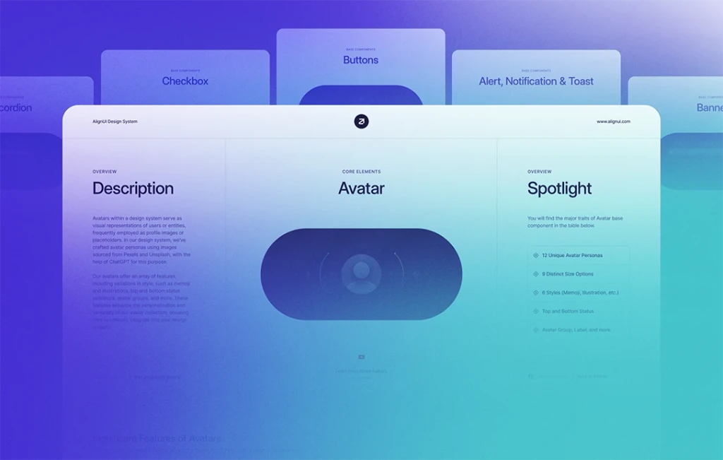
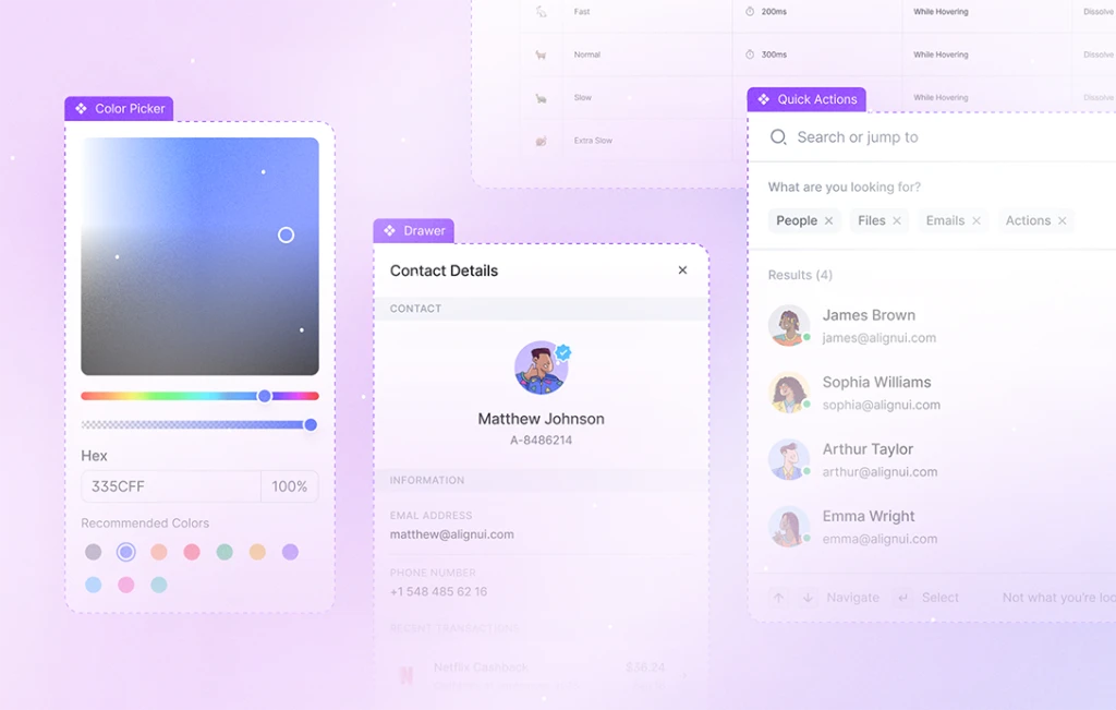
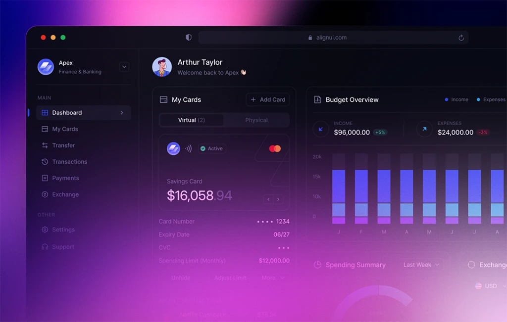
Last week, we proudly announced the completion of documentation for our Core Elements. In the past week, our focus shifted towards documenting our Base Components. We're excited to report that we've already covered one third, and our team will continue this documentation effort. Meanwhile, we also made a few enhancements on several components such as Banner, Button Group, and more. Let’s get started.
📖 Base Components Documentation (In Progress)
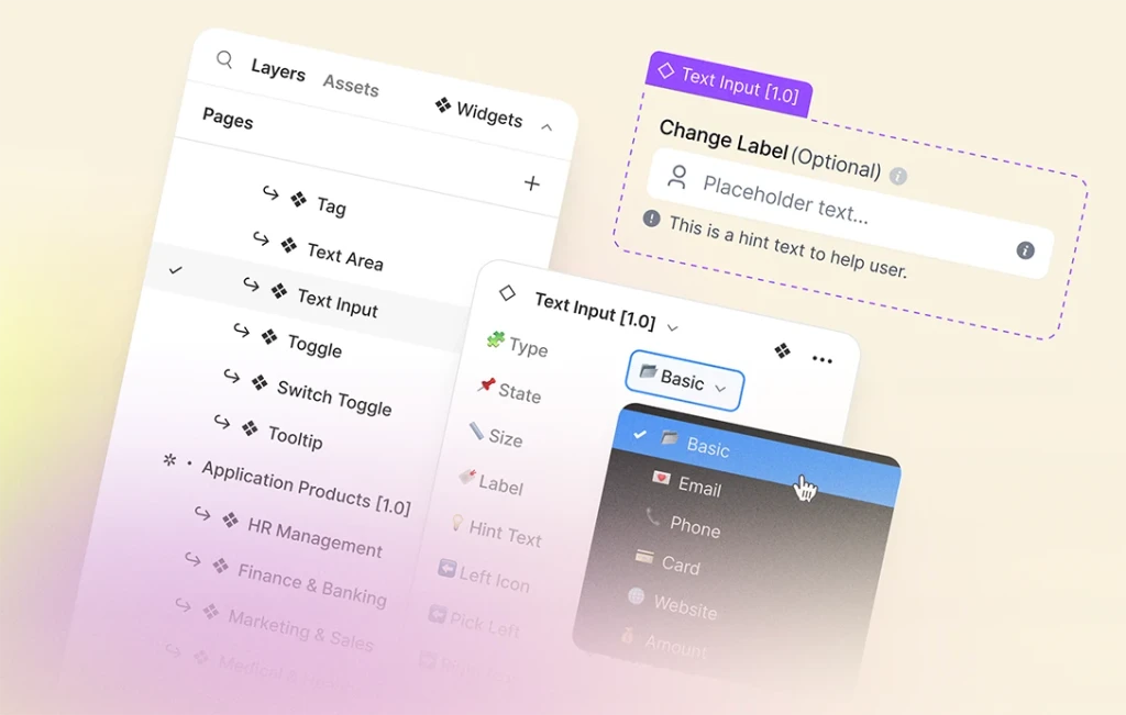
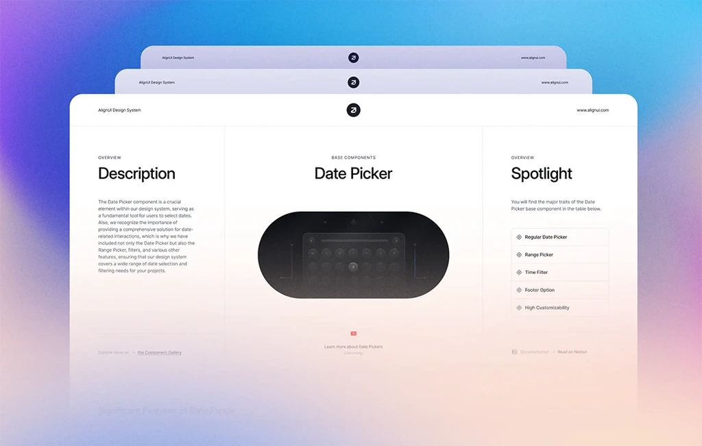
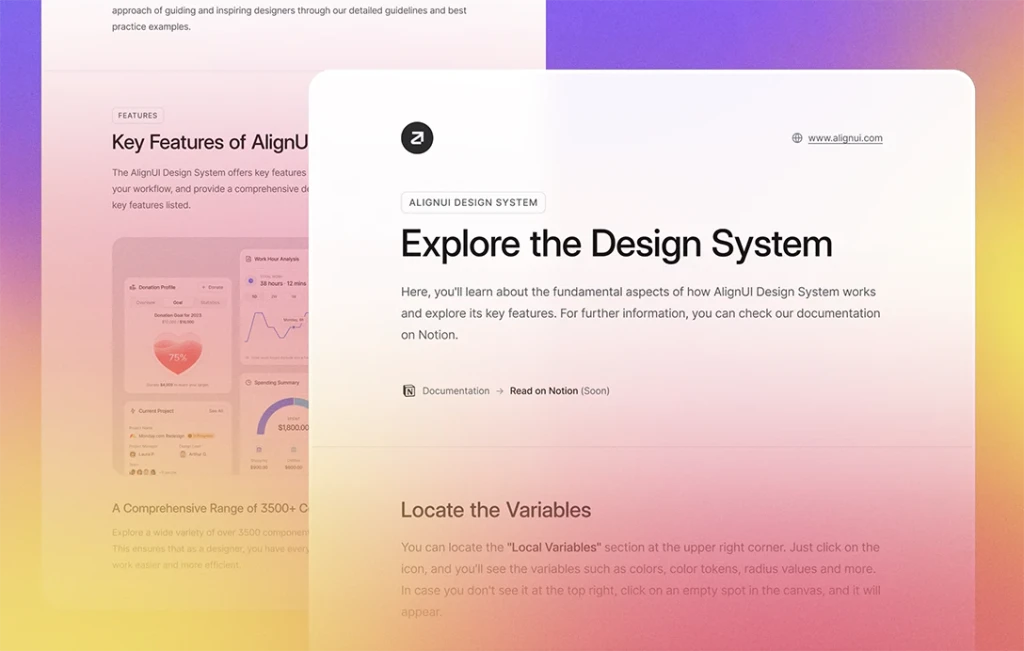
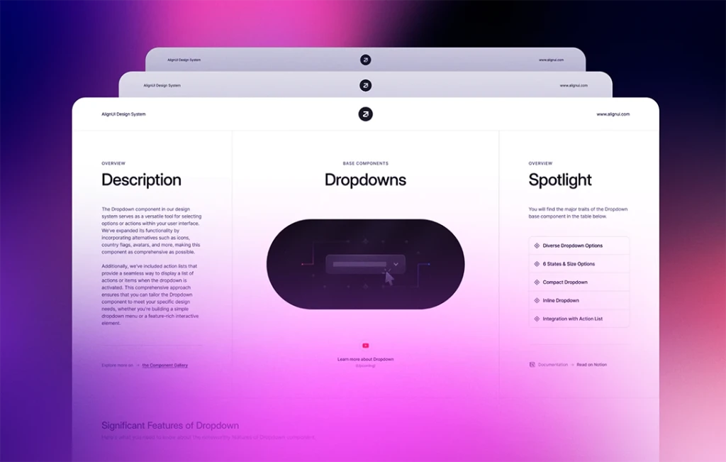
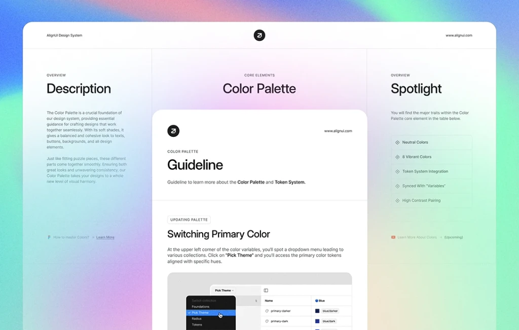
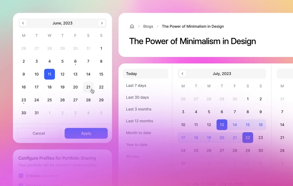
Our documentation process follows a structured format. We begin with an overview, providing a detailed description of the component and highlighting its key features. Following this, we present the component(s) below. Next to the overview, you'll find comprehensive guidelines, prepared to cater to both novice and experienced designers. To guide and inspire you, we also provide numerous examples and prototypes for each component.
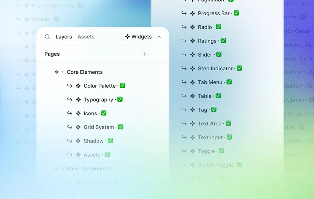
Here's a list of base components for which we've already completed documentation:
- Accordion
- Alert, Notification & Toast
- Avatar
- Badge
- Banner
- Breadcrumbs
- Buttons
- Button Group
- Checkbox
- Content Divider
⬆️ Minor Enhancements (Updated)
In our commitment to continuous improvement, we've made several minor enhancements to elevate functionality:
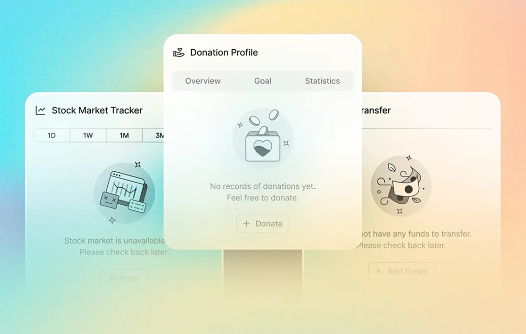
Banner: Colors and styles are synced with Alert, Notification & Toast component.
Breadcrumbs: Now supports adding a fifth breadcrumb.
Button Group: Enhanced usability with property adjustments.
As we continue our documentation journey, we also review and enhance our components along the way. To keep up with the latest updates and enhancements, follow us on Twitter, where we will also be sharing daily sneak peeks of the documentation. Your continued support motivates us and helps us to deliver the best design system possible.

