Welcome to Weekly Update! In this update, we are excited to introduce a range of new assets to enhance your design experience. From major brand cards and logos to country flags, common logos, app store badges, and more. Additionally, we will provide examples for components to assist, guide, and inspire our users.
⭐️ New Assets
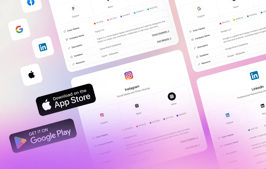
- +25 Major Brand Cards & Logos (with variants)
- +270 Country Flags
- +250 Common Logos
- 8 App Store Badges (with variants)
- 20 Emoji Cards & Emojis
🪗 Accordion (New)
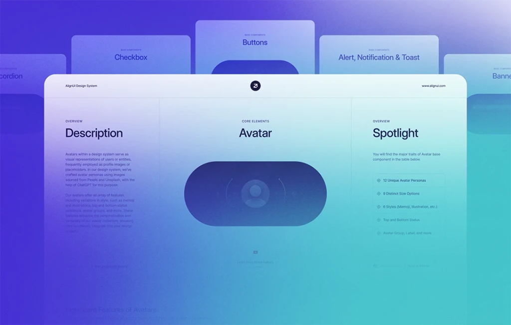
Explore our new accordion component, allowing you to present content in a collapsible format. Perfect for organizing and managing large amounts of information while optimizing screen space.
🎉 Social Buttons (New)
Enhance social interactions with our selection of social sign-in buttons. Seamlessly integrate social media authentication and sign-up features into your designs, making it effortless for users to join and sign in using their preferred social media accounts.
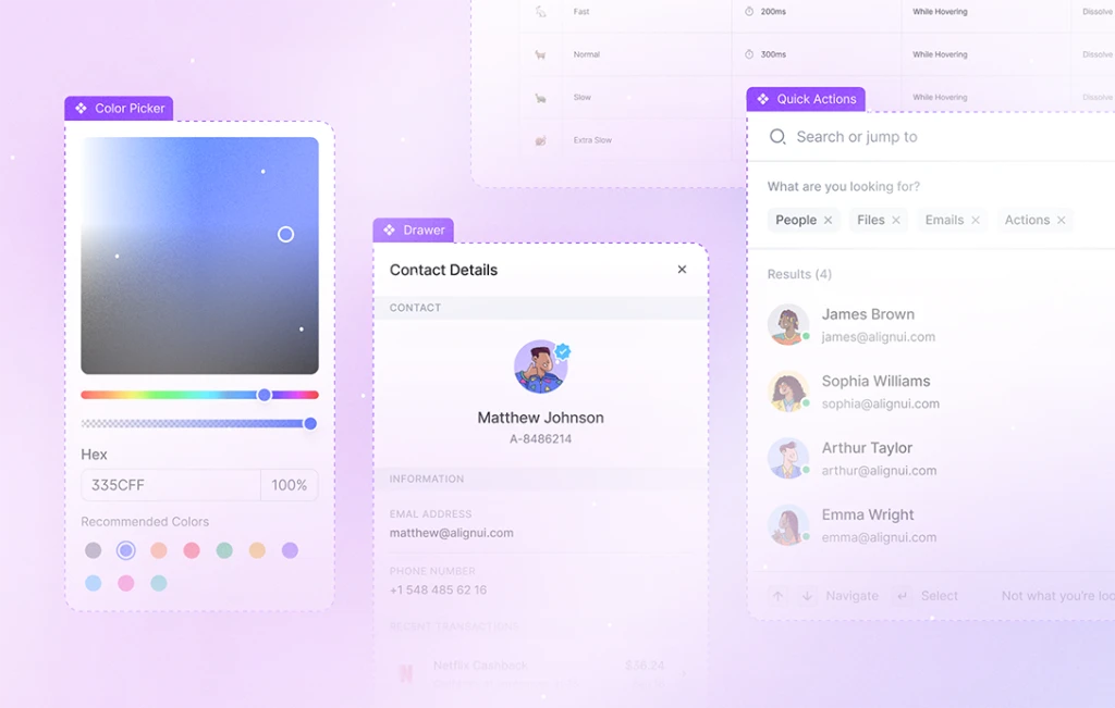
📖 Providing Examples for Components (New)
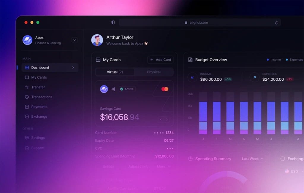
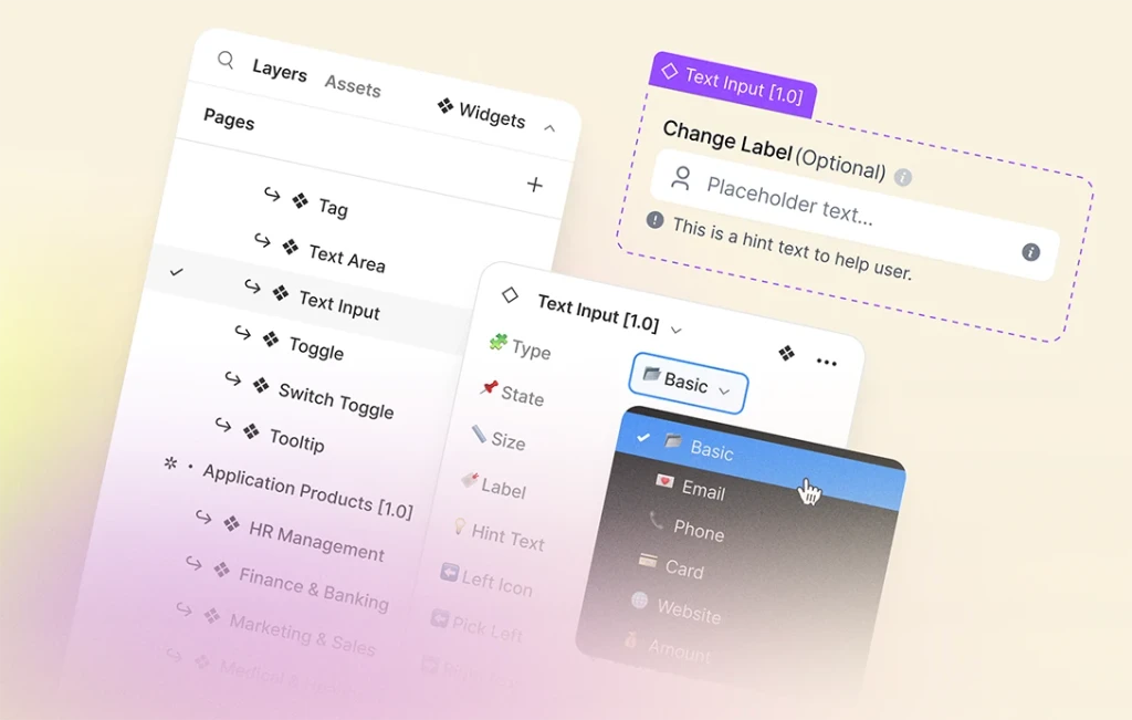
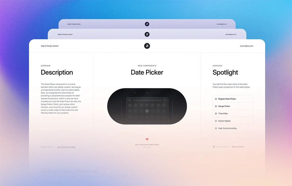
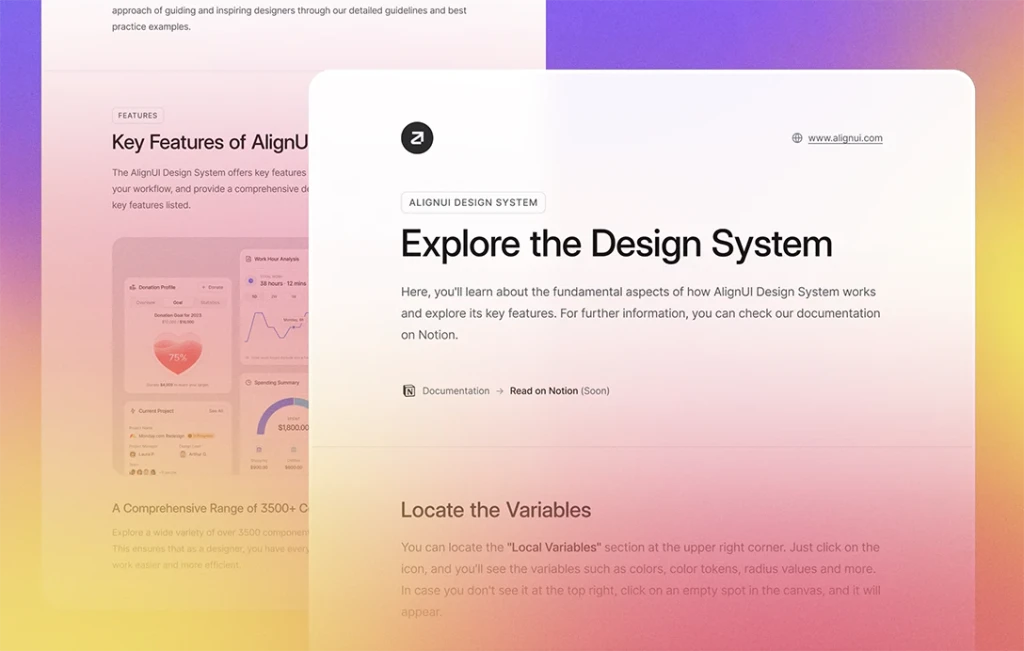
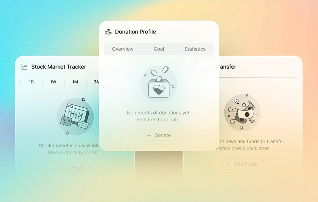
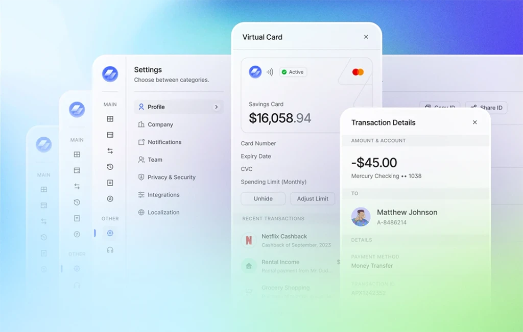
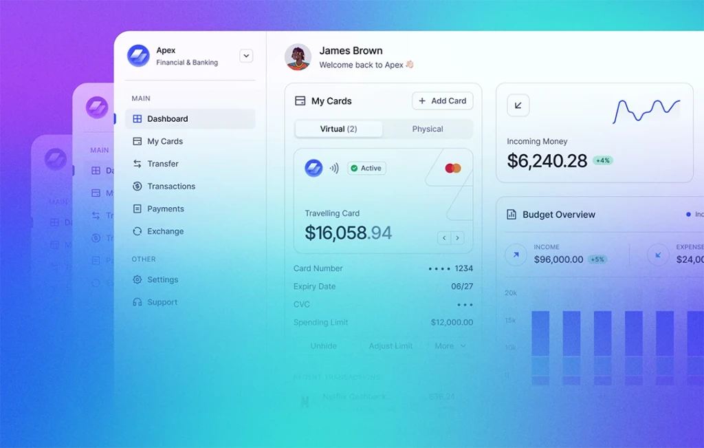
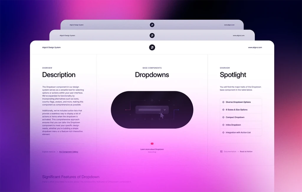
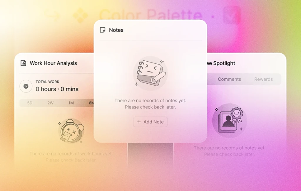
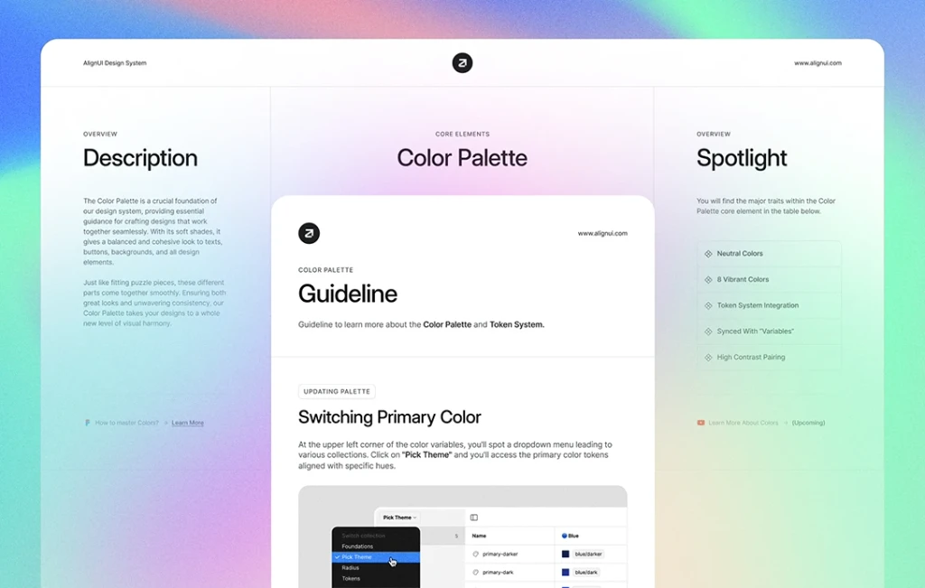
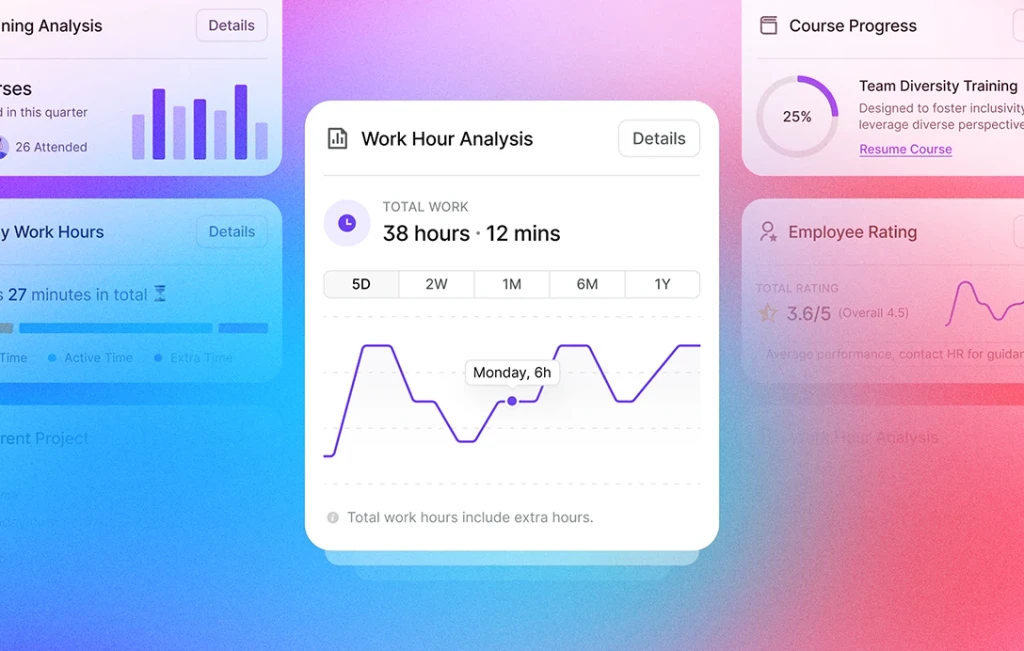
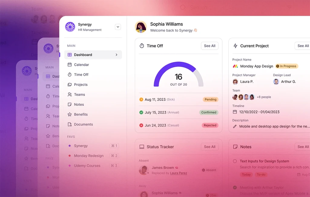
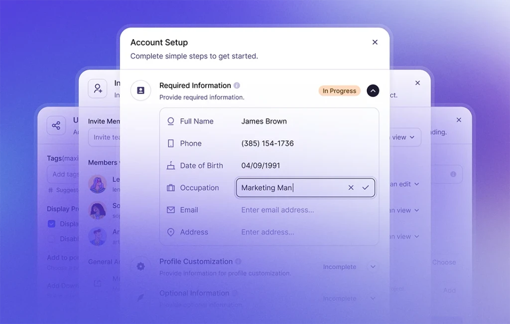
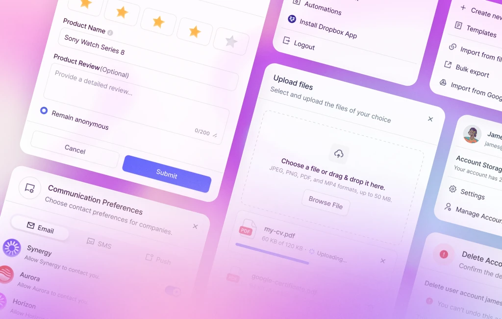
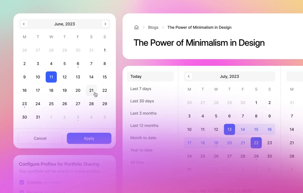
To assist, guide, and inspire our users in utilizing these assets and every component effectively, we have prepared a collection of comprehensive design examples. These examples showcase how to incorporate the various components into your designs, providing guidance on best practices and illustrating the possibilities for creating cohesive and visually appealing designs.
🚀 Next Update
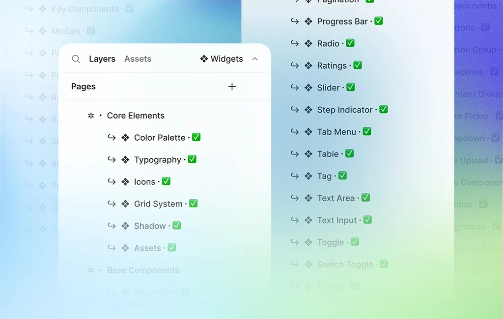
In our upcoming update, we are excited to introduce new additions to further enhance your design capabilities. Here's a sneak peek of what's coming:
- Breadcrumbs: Navigate users through complex hierarchies and provide clear context with our breadcrumb component.
- Button Group: Group related buttons together and improve the visual hierarchy of your interfaces for enhanced user experience.
- Content Divider: Add visual separation and structure to your content with our content divider component.
Stay tuned for these exciting additions and more, as we continue to expand and refine our design system to empower your creative endeavors.

