For the past week, our primary focus has been on creating illustrated empty states for Finance & Banking dashboard widgets, similar to what we did for the HR Management widgets. Additionally, we've implemented minor enhancements to various components and their properties to ensure a smoother user experience. Without further ado, let’s dive into what we accomplished this week!
🎨 Illustrated Empty States for Finance & Banking Widgets (New)
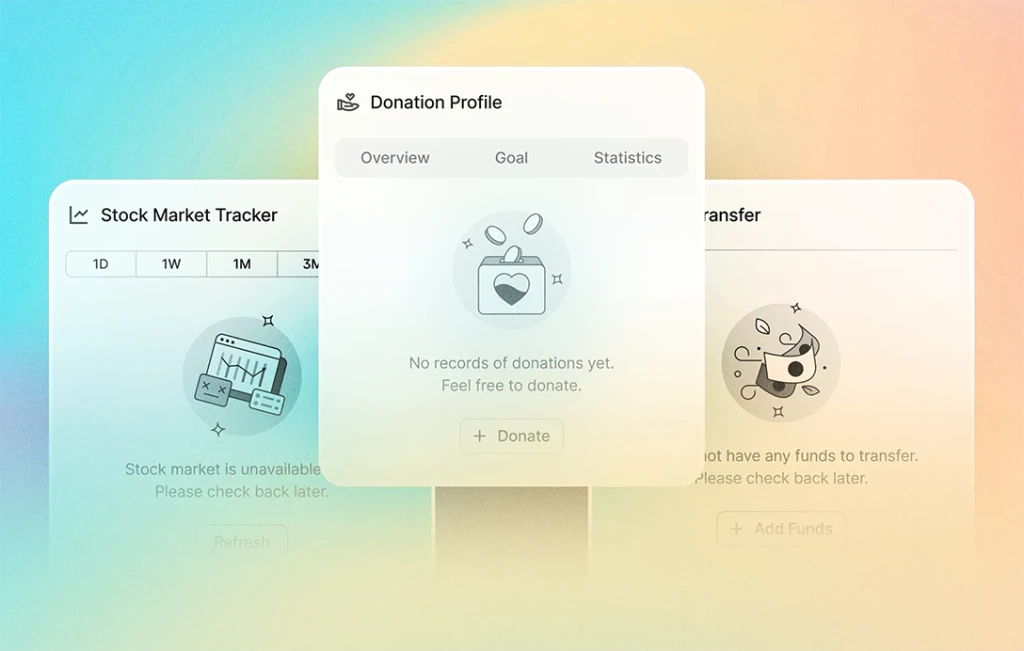
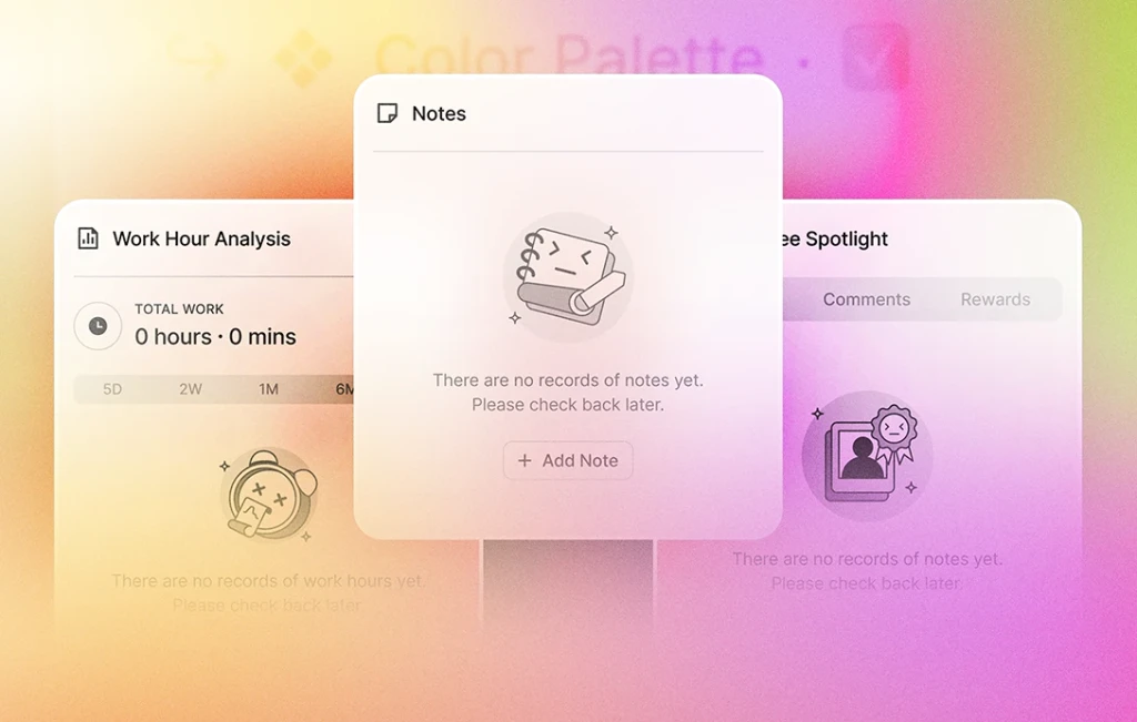
As mentioned in last week’s update, our team has dedicated efforts to provide empty states in the form of illustrations. We're delighted to announce that we have successfully crafted 12 unique empty state illustrations, one for each widget on the Finance & Banking dashboard.
Here’s the list of widgets that now feature illustrated empty states:
- Stock Market Tracker
- My Cards
- Spending Summary
- Exchange
- Currency List
- Saved Actions
- Recent Transactions
- My Subscriptions
- Quick Transfer
- Donation Profile
- My Cards (Vertical)
- Budget Overview (Horizontal)
The mini-sized widgets also have empty states, but they are not illustrated because they display charts, and their empty states are designed to complement the charts.
⬆️ Minor Enhancements (Updated)
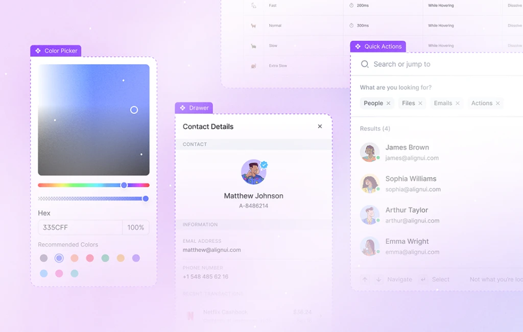
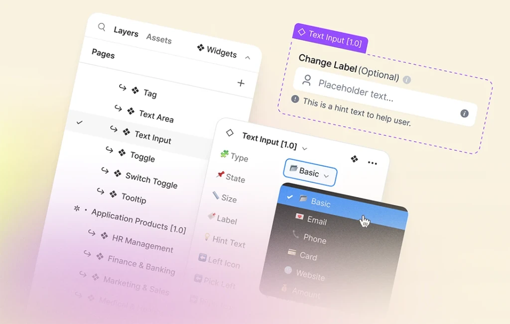
We've focused on refining AlignUI Design System components to elevate your overall experience. A notable addition is the introduction of a “Basic” option for the “Type” properties. This approach reduces the amount of options in the property panel, allowing for smoother navigation as you see fewer options.
Enhancements have been applied to the following components:
- Buttons: The "Important" type of button has been renamed to "Neutral" to enhance clarity, aligning it with others named as primary and error.
- Checkbox, Radio & Toggle Card: Standardized content options such as avatars, icon and brand logo, including the addition of an option to incorporate a placeholder logo alongside other elements.
- Content Divider: Introduced a new type named “Solid Text Divider”, enabling you to separate content with a solid background and text.
Furthermore, we've enriched our examples for each component, providing you with more content for inspiration and guidance.
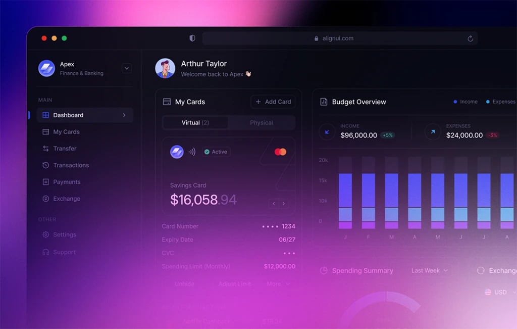
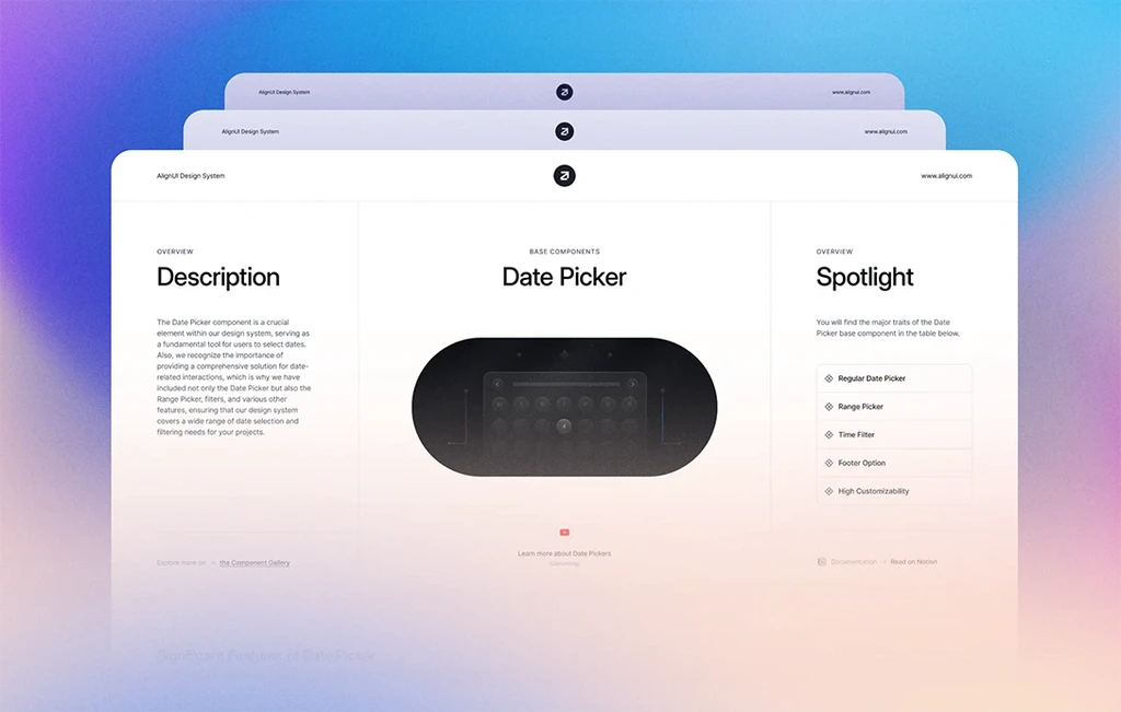
With the completion of the Finance & Banking product, featuring a comprehensive dashboard with unique widgets, settings pages, send money flow, and more, our attention now shifts to a thorough review of all components. This involves documenting details, providing real-life examples, and creating prototyping examples for each.
This means that we are only a few steps away from the release. Stay tuned for the latest updates and exclusive sneak peeks by following us on Twitter.

