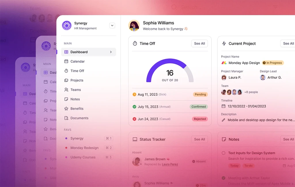
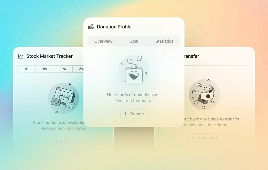
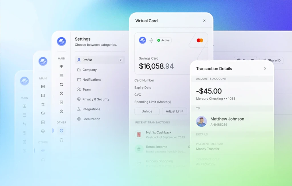
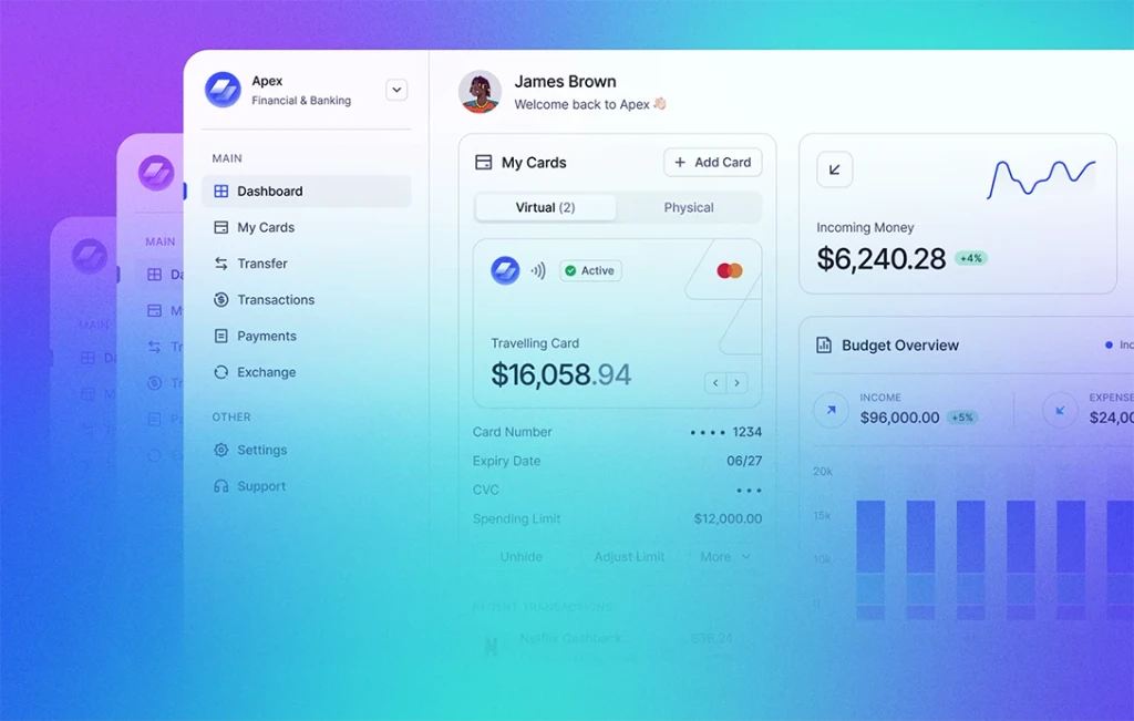
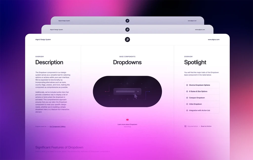
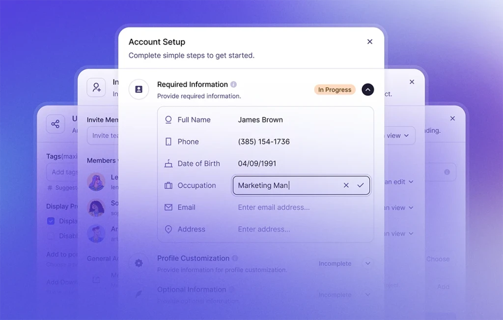
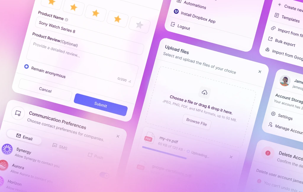
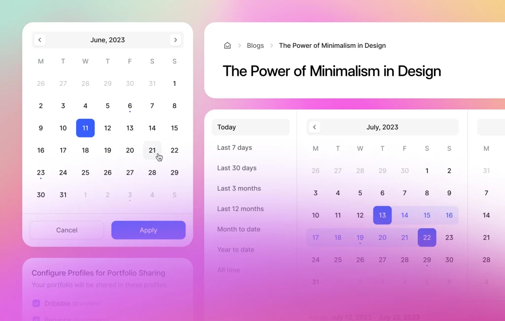
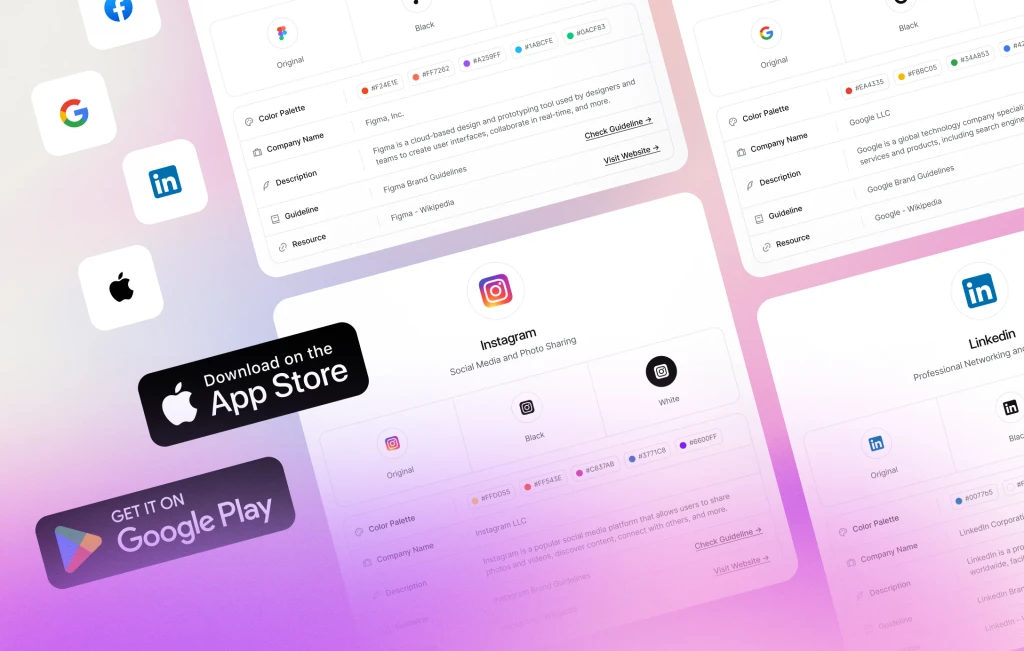
As we have completed our base component library, we started designing our very first product Synergy HR Management. Designed to align with user preferences, these pages offer a seamless blend of navigation and functionality. Now, we are here to guide you through the pages that have completed so far:
- Dashboard
- Calendar
- Teams
- Settings
We've used three different grids, each tailored to cater to the navigation bar preferences of our users. For instance, if you opt for a sidebar navigation, the grid changes depending on whether it's expanded or collapsed. This feature is seamlessly extended across all pages, including the dashboard, settings, and other sections.
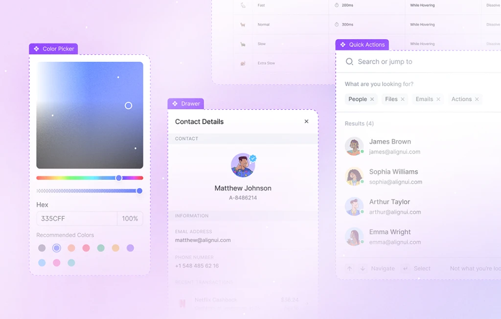
Now, let’s delve into the components that have contributed to the creation of these pages.
🧭 Navigation Components (New)
Sidebar
Easily toggle between expanded and collapsed modes, or customize with sidebar headers, footers, user profile cards, and more. You can prefer showing and hiding the side content and supporting content, as you wish.
Topbar
Featuring an array of elements such as navigation items, user profile, search input, and action buttons, our topbar provides seamless access to key functionalities while maintaining a sleek and user-friendly design.
🎩 Header Components (New)
Page Header & Section Header
Customize your page & section header by toggling items like avatars, left icons, and dividers. With easily adjustable properties, you can add a dropdown menu into section headers, providing tailored navigation experiences.
🧮 Widget Components (New)
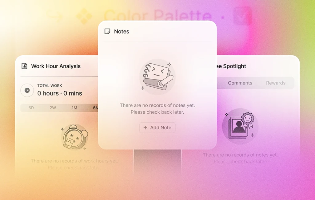
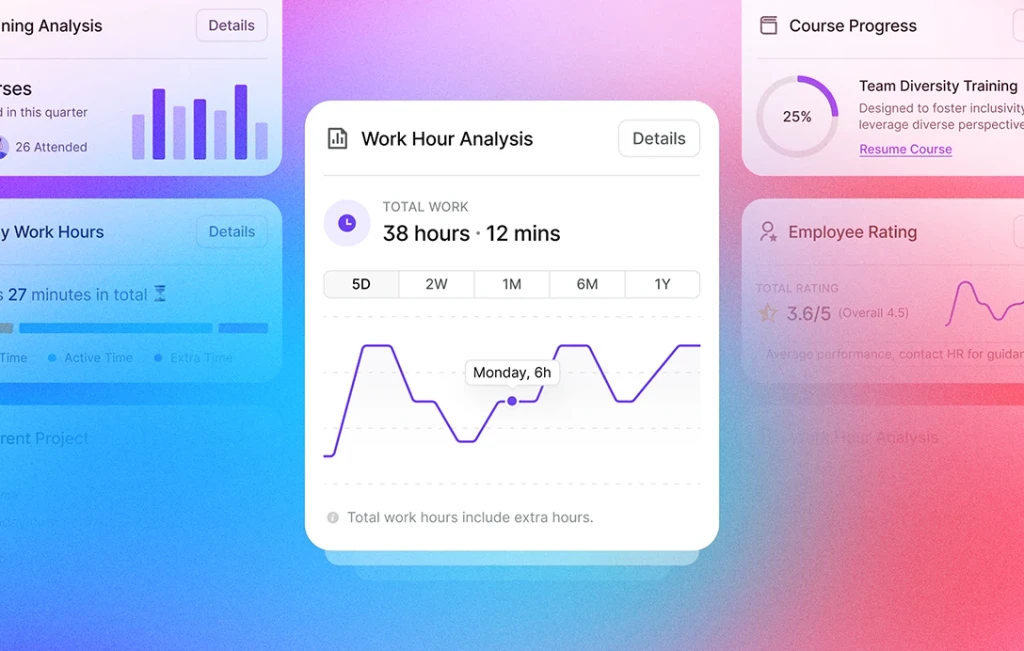
Our collection includes five distinct widgets: Time Off, Status Tracker, Current Project, Notes, and Schedule. Each widget is intricately designed with inner components for enhanced functionality. For example, the Schedule widget includes card, date, and more components, all tailored to the HR Management section.
📊 Table Components (New)
Designing tables has been quite challenging for us but pushing our limits has brought us rewarding results. Now, you can easily customize table header cells with checkboxes, sorting icons, and more. When it comes to the table row cell components, we offer state customization, priority settings for emphasis levels, sizing and various content. With the ability to add rating, progress bar, badges, and more, the possibilities for data display are limitless.
📅 Calendar Components (New)
Calendar Card
Display events and meetings in size variations, flexible positioning options, and more. Embrace the power of various states, from empty to disabled, ensuring seamless event tracking and management.
It takes only a few clicks to change the state of the cell, as empty or disabled, and add the content you want.
Filter Bar
Featuring buttons, button groups, search bars, and more, this component ensures a seamless and user-friendly filtering process, enabling users to access the information they need effortlessly.
Upcoming Cards
With four distinct statuses, this component provides a visual and functional overview of scheduled activities, keeping you organized and prepared.
⚙️ Settings Components (New)
Upload Photo/Logo
These components cater to both avatars and brand logos, with options for empty or uploaded types. Moreover, the options of uploading and removing dynamically changes according to the type you choose.
Integration Cards
You can showcase your integrations using vertical cards paired with a button or horizontal cards combined with a toggle.
As we continue our journey of refining and expanding our components, we've taken another step forward by introducing the Status Badge component and enhancing the Tab Menu component.
🥇 Status Badge (Updated)
These badges feature a simpler design, representing four distinct states: completed, pending, failed, and disabled. They are also available in both left icon and left dot variations.
↔️ Tab Menu (Updated)
We have made significant improvements on both vertical and horizontal tab menu, particularly tailored for enhanced functionality in settings pages.
Now that we have covered our new and updated components, let's take a glimpse into our upcoming enhancements and features on the horizon.
🚀 Next Update
- Feature card for navigation sidebar
- New widgets for HR
- Integration page
- Streamlined login, signup, and onboarding processes
- Updating step indicator for onboarding
That concludes our update for now. Stay tuned for further advancements and more, as we strive to provide you with the most comprehensive and user-friendly design system.

