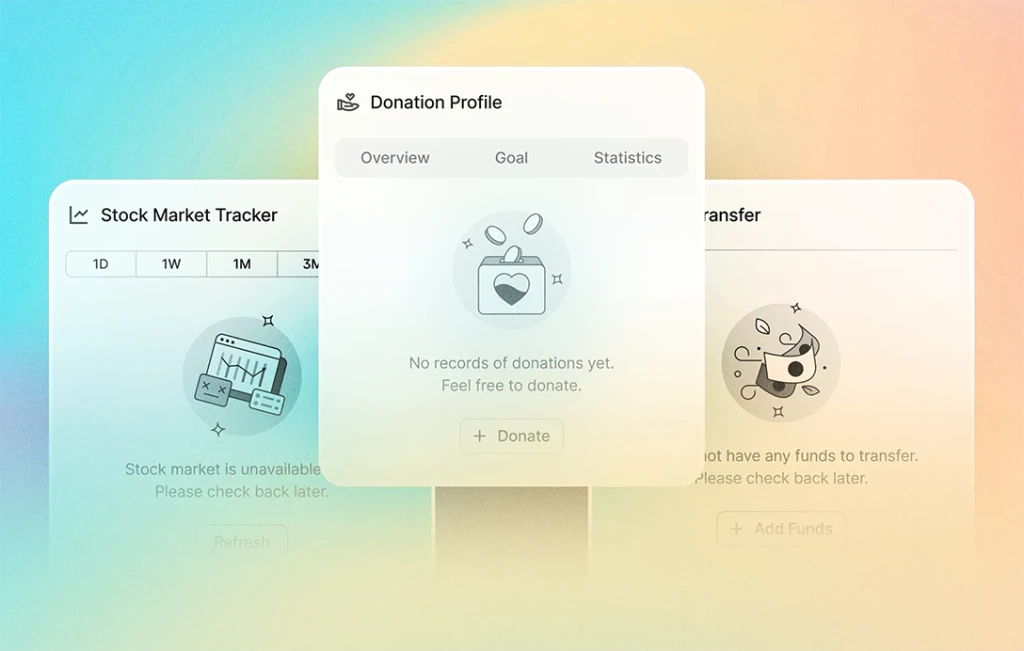
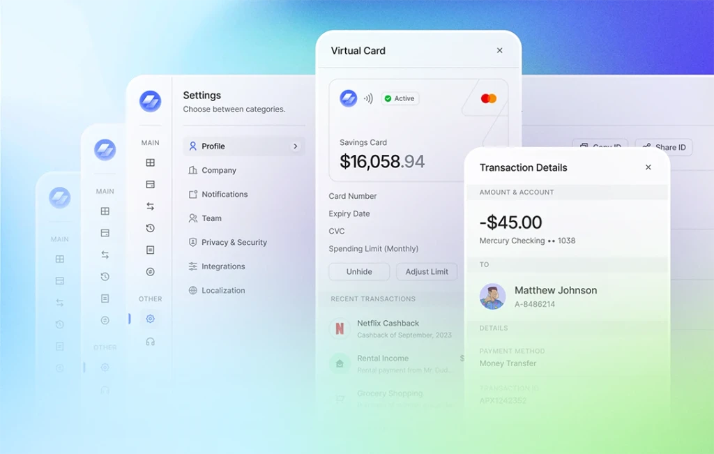
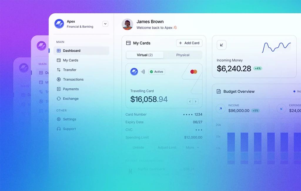
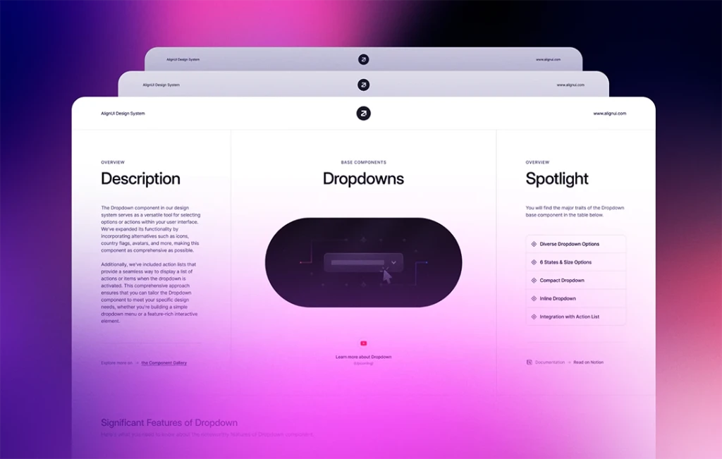
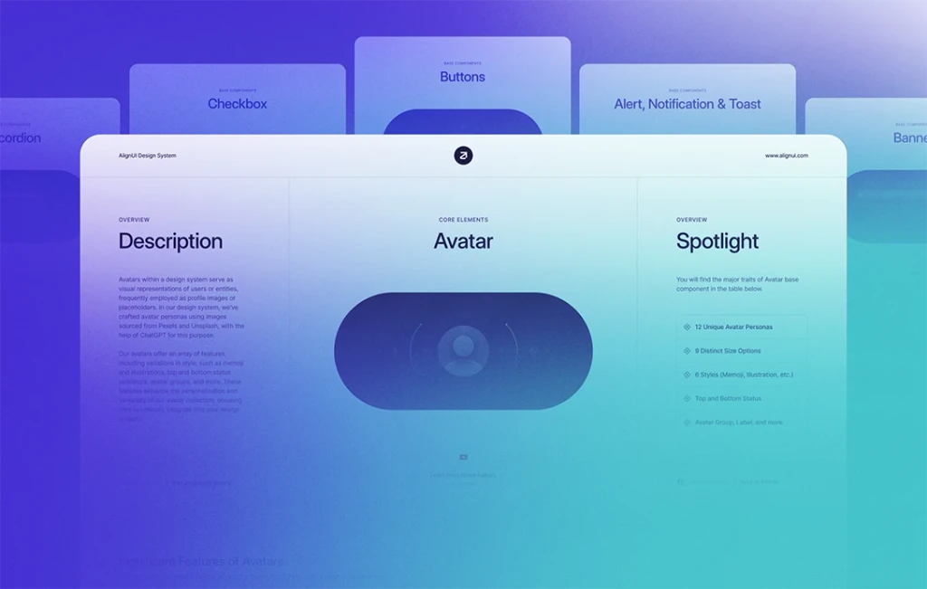
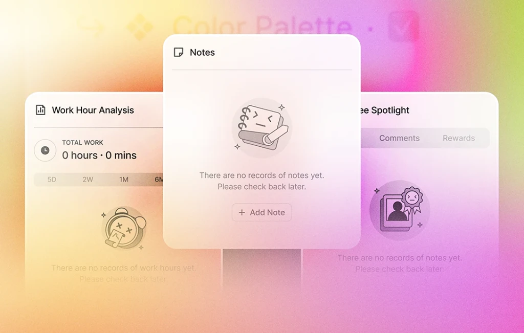
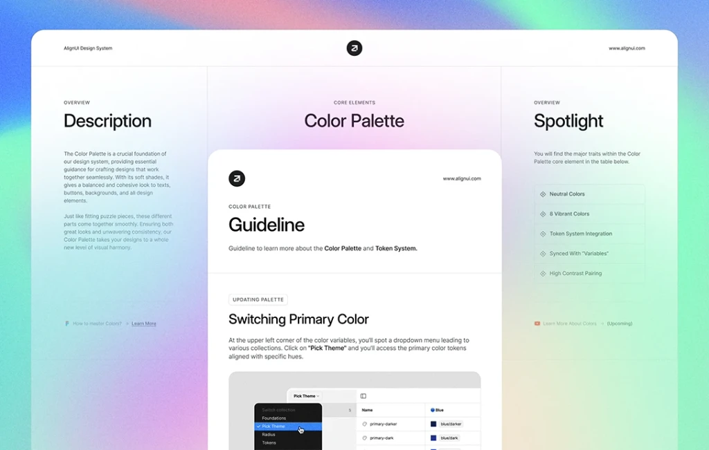
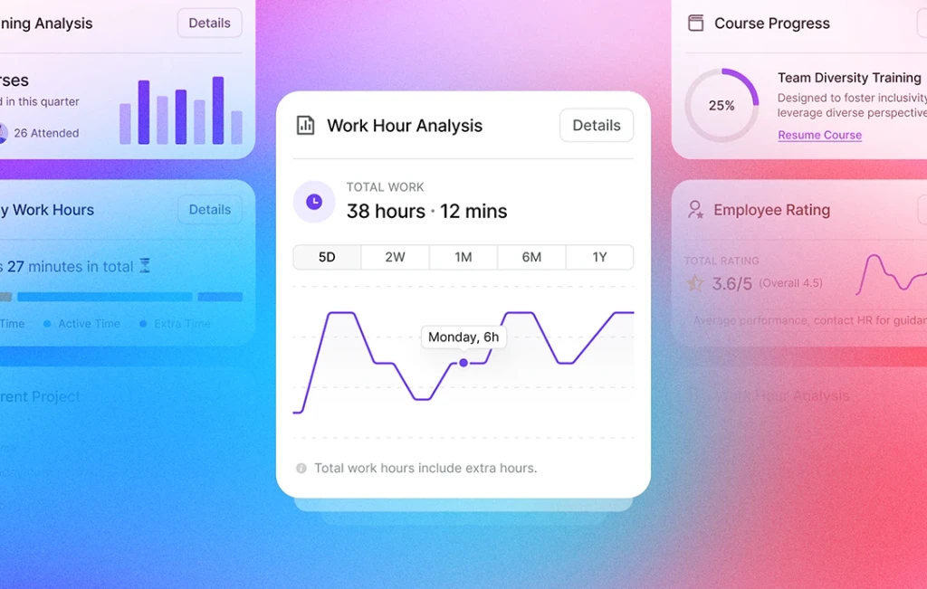
During the past week, we focused on improving the orientation pages — Welcome, Get Started, and Cover — for the Figma file of AlignUI Design System. We fine-tuned our drafts to ensure a friendly introduction to the Figma file. Alongside this, we completed a thorough review of all components, names, and properties, making a few final enhancements and additions. Here's a detailed overview of what we accomplished:
👋 Orientation Pages (Completed)
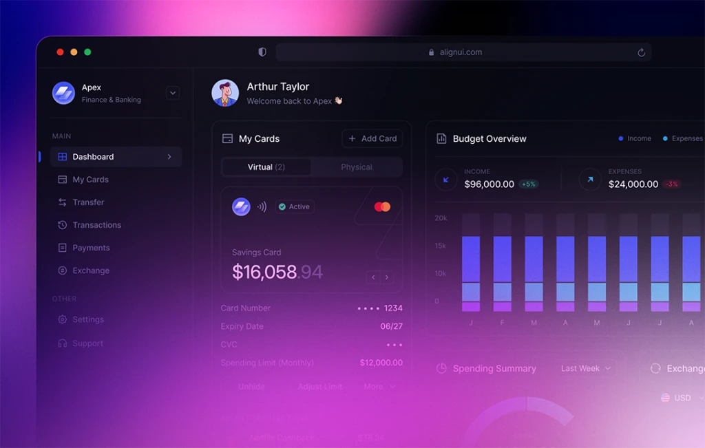
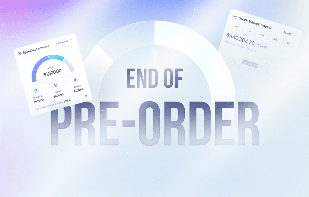
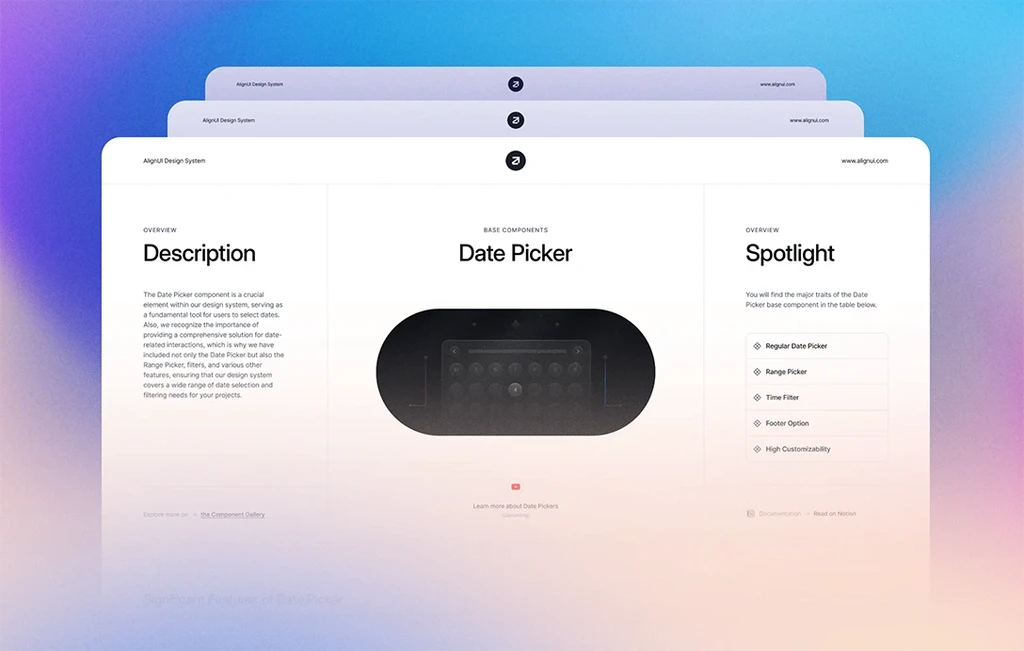
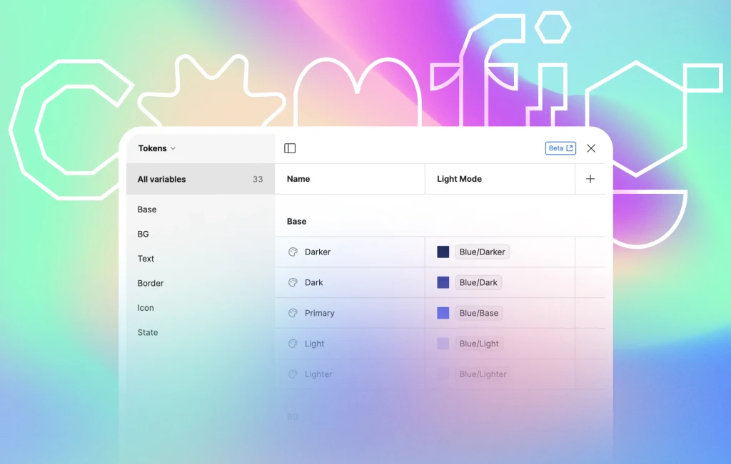
Firstly, we know how crucial it is to make a great first impression. So, this week, we focused on creating a welcoming Cover Photo, the first thing you'll see.
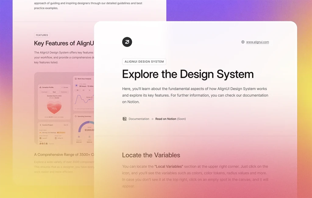
Next up, check out the Welcome page where you'll learn what makes AlignUI special, its main features, and where to get it. You'll also find our team’s contact info and social media details for feedback, sneak-peek of our License Agreement and special thanks.
Lastly, explore the Get Started page where we help you set things up by guiding you through downloading and installing the fonts you need and learn different ways to use our design system with simple explanations. We'll also show you around key parts, like where to find variables, styles, important settings, and more. If you're new to Figma, we've also included helpful links to Figma’s website.
⬆️ Enhanced Components (Updated)
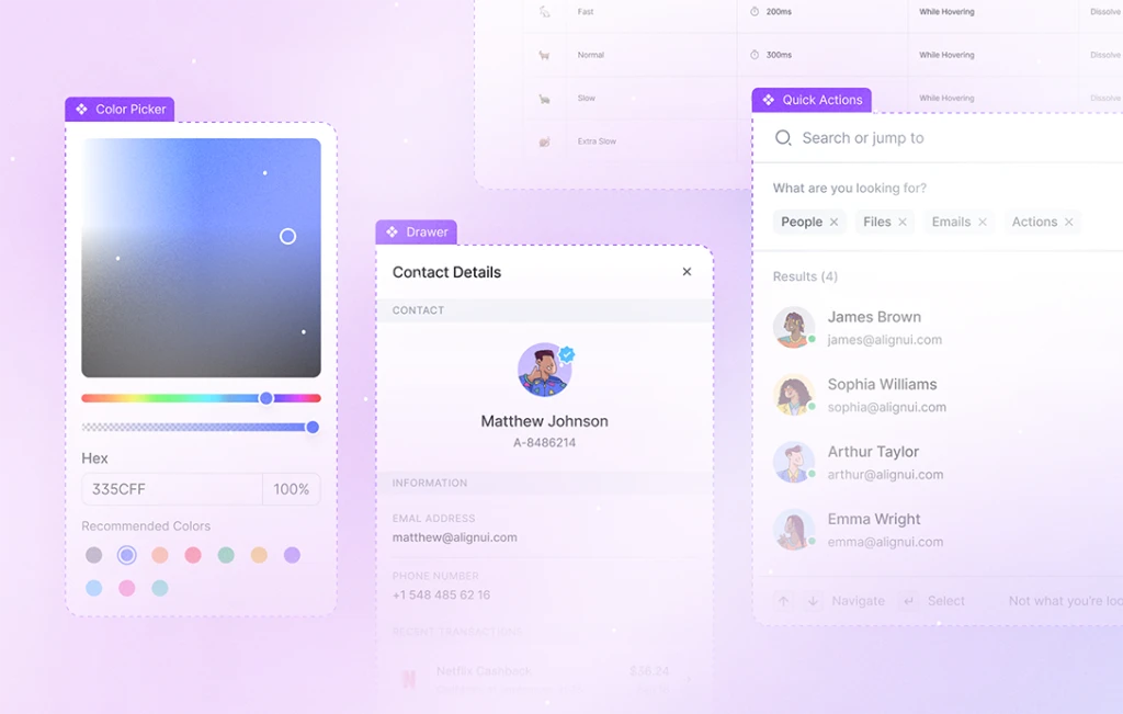
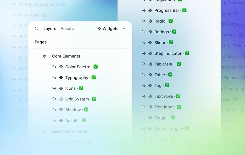
We've performed a comprehensive final review of all components, names, properties, and every detail. As a result, we've identified areas for improvement and implemented the following enhancements:
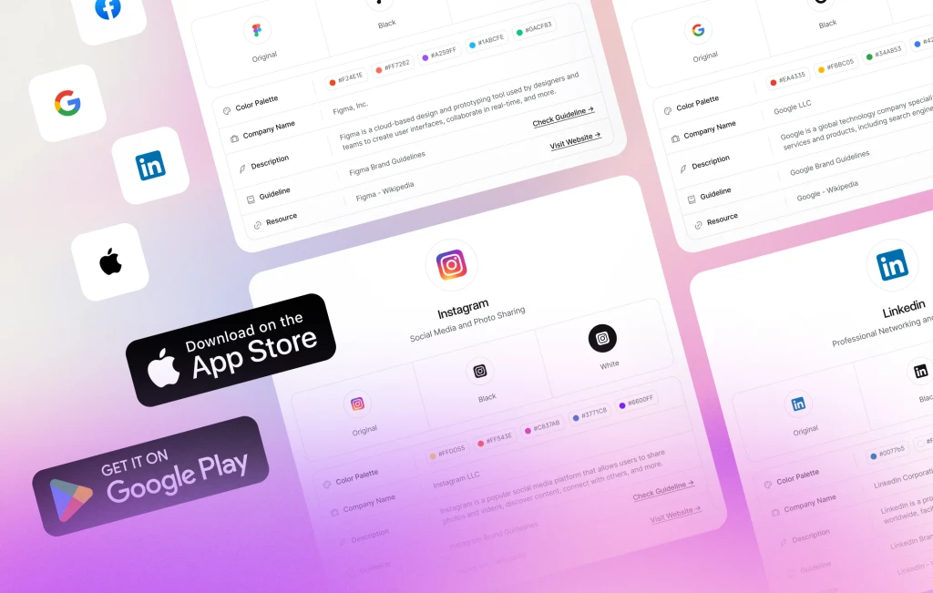
Dropdown: Added an X-Small (32px) option for more versatility.
Dropdown Items: Introduced options for country flags, card providers, and placeholder logos to enhance dropdown menus.
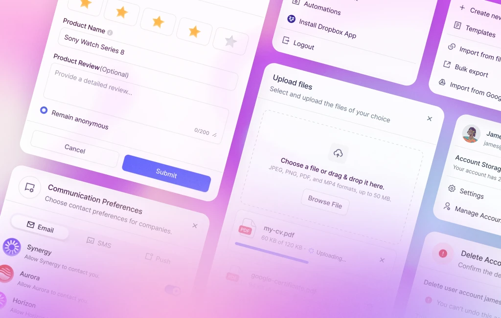
Image Upload: Added alignment options for horizontal or vertical use.
Content Label & Content Card: Synchronized options with Checkbox, Radio, and Toggle Label/Card components for consistent layouts.
Modal Header: Improved size and variety for better modal design.
Modal Footer: Added options for displaying information and a toggle label to enhance variety.
Modal Overlay: Introduced a modal overlay component for use as a background behind modal or drawer components.
Rating: Added the Rating Cell component for flexible use of star and heart ratings.
Step Indicator: Added the Step Indicator Sidebar for onboarding processes. Separated horizontal and vertical step indicators for clarity.
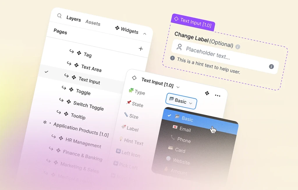
Text Input: Tag and Counter Inputs are now separate from the Text Input components because their layout and function differ from the others.
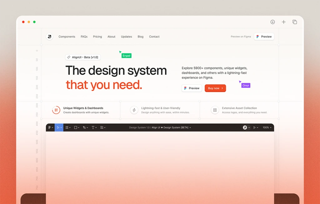
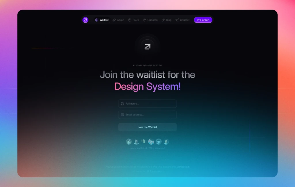
Given the completion of the orientation pages — Welcome, Get Started, and Cover — and the thorough review and refinement of all components, we find ourselves just two steps away from the release. The first involves finalizing our documentation, ensuring clear presentation, thorough explanation, and enriched with examples, a process we've been dedicated to for the past couple of weeks. The second step is to redesign our website to showcase the design system, shifting our focus from the waitlist to the release.
In summary, the upcoming week will be dedicated to fine-tuning component documentation and redesigning our website. Each passing day brings us closer to the release of AlignUI Design System. Stay tuned for the latest updates and exclusive previews by following us on Twitter.

