Introduction
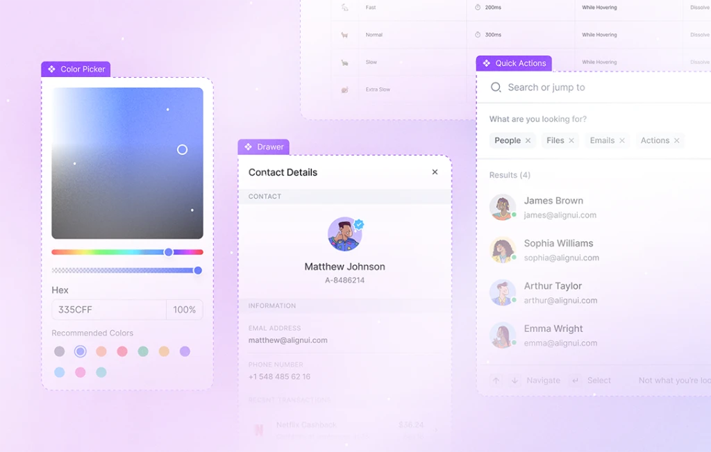
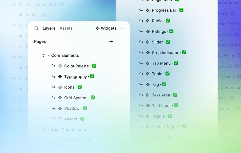
We are thrilled to announce that we have reached a huge milestone by completing the components. In this weekly update, we introduce our new components, updated components, and offer a sneak peek of what we have in our design system for the upcoming week.
To get started, let's discover the new components in our design system!
📝 Text Area (New)
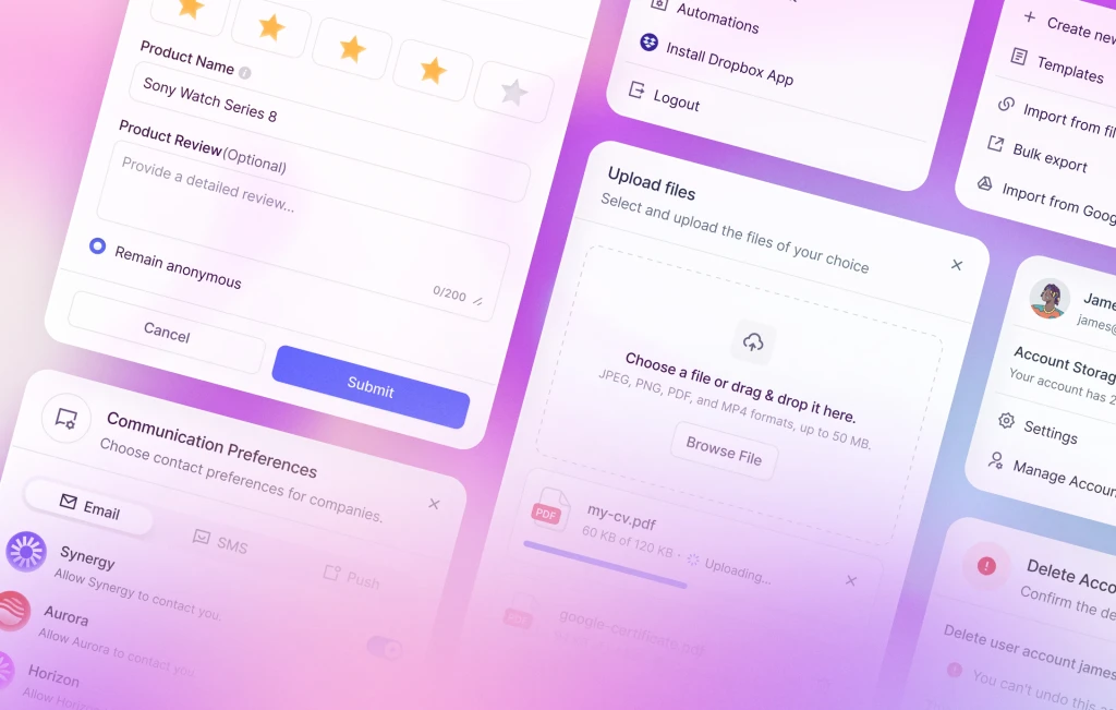
Discover our versatile Text Area, featuring label and hint text, along with a bottom bar housing a character counter and resizing icon. Experience various states such as filled, error, and disabled, enhancing user interactions.
✍🏻 Text Input (New)
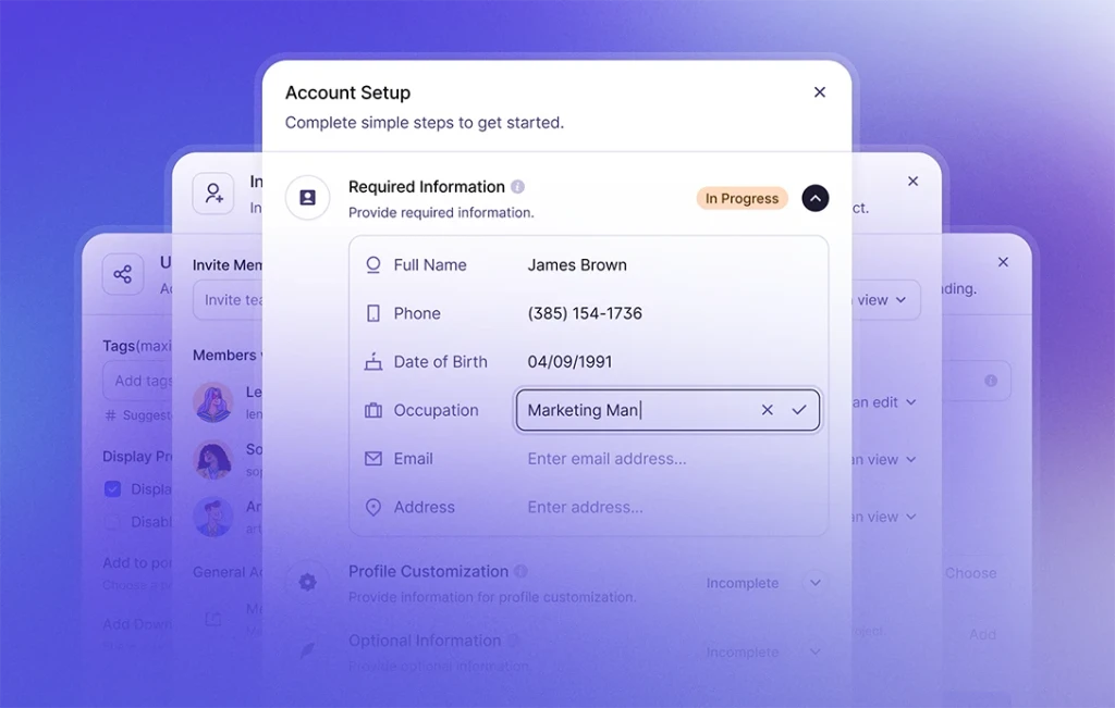
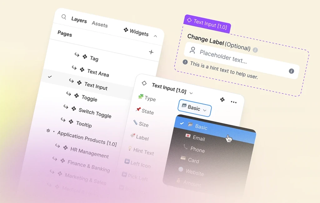
Our most comprehensive component, the Text Input, offers 15+ types to cater to diverse use cases. Here’s the full list of the text input types:
- ⚪️ Default
- 💌 Email
- 🔒 Password
- 📞 Phone
- 💳 Payment
- 🔍 Search
- 🌐 Website
- 💰 Amount
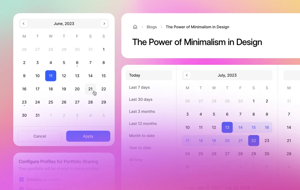
- 📅 Date
- 🔘 Button
- 🔽 Dropdown
- 🔢 Counter
- 🏷️ Tag
- 🙂 Emoji
- 1️⃣ Digit
- ✏️ Inline
From Default to Payment, you can edit the input type effortlessly and transform it with just a few clicks. Show/hide labels, sublabels, link buttons, and hint text to personalize the input field. Also, each type comes with multiple states and sizing options as small and medium.
🔘 Toggle (New)
Meet the new Toggle component, including Toggle Label with a description and link button option, and Toggle Card with description, icon, avatar, and more. Also, embrace the Toggle Switch component with the flexibility of the text, text & icon, and only icon variants.
🗒️ Tooltip (New)
Enhance your designs with our Tooltip components, available in two colors and three different sizes enabling you to add also a description. Customize the tooltip tail and position it across eight different places for a seamless user experience.
Now that we have covered the new components, we can move on with the updated components.
🚨 Alert & Notification (Updated)
Experience the updated Alert components now combined with Notification & Toast components, featuring lighter variants and an x-small size option for increased versatility.
🎛️ Button (Updated)
The Compact Button component has received a functional makeover with fewer variants and increased flexibility. Also, you can easily customize the corners on the properties section.
Lastly, let's take a glimpse into our upcoming plans and what you can expect in our next update.
🚀 Next Update
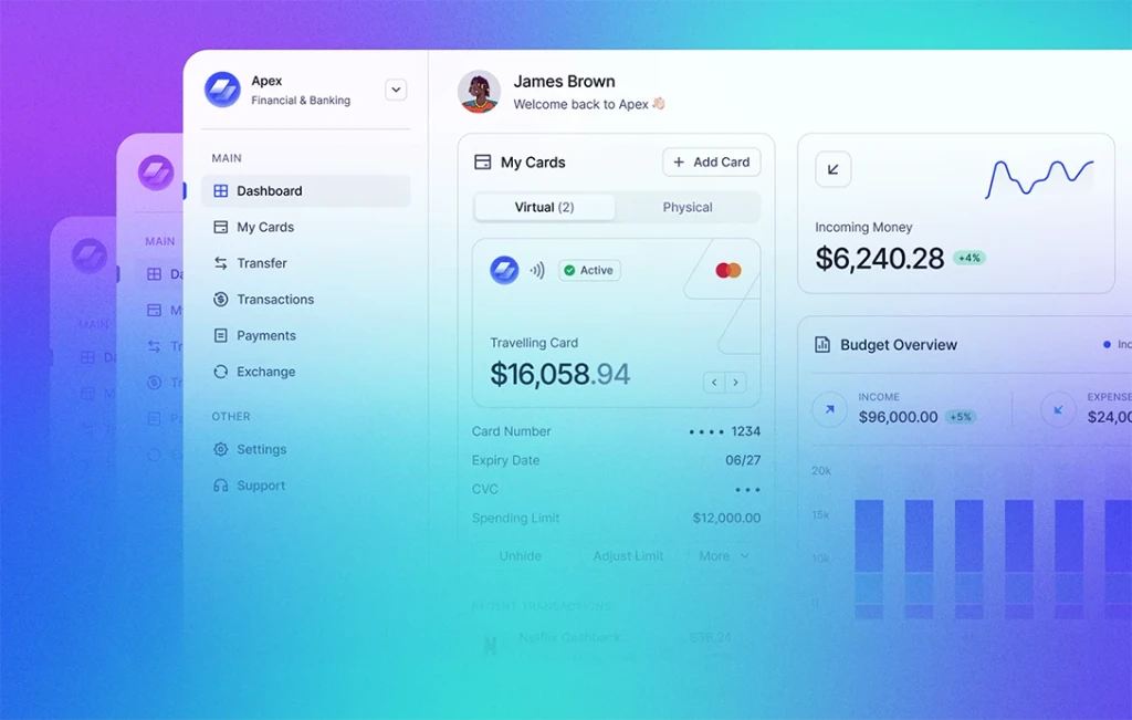
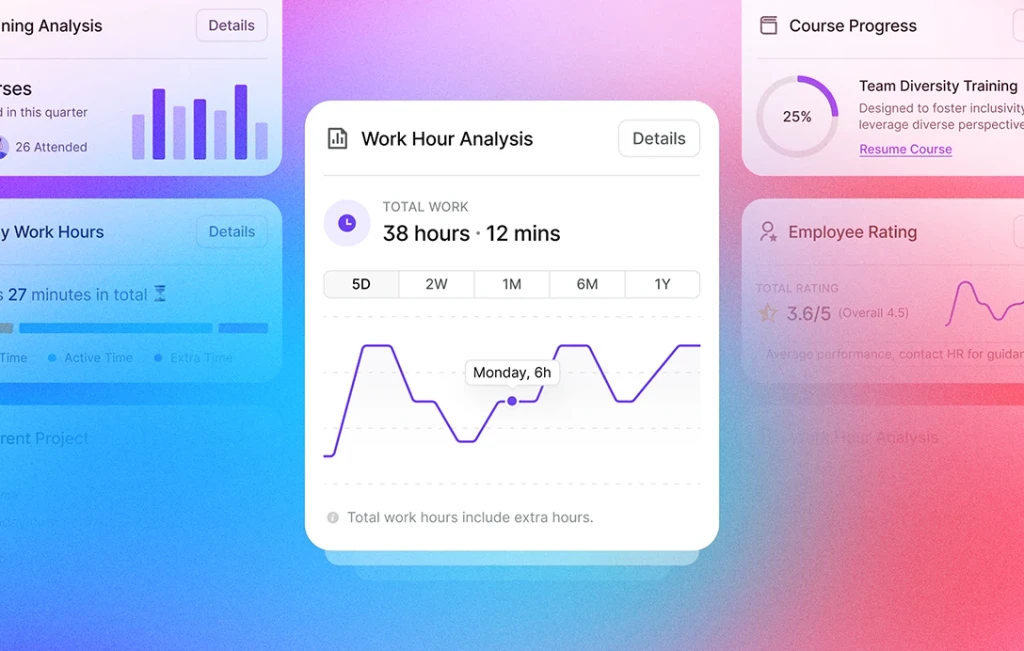
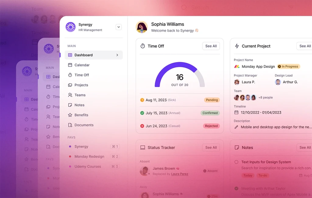
Having achieved a significant milestone with the completion of our component library, we are excited to embark on a new endeavor – designing tailored dashboards for various sectors. Our first creation will be the HR Dashboard, where we are crafting essential widgets. Stay tuned for navigation bars, subpages like calendar, settings pages, and more.
Keep an eye out for these thrilling enhancements and more as we continuously enrich and perfect our design system, empowering your creative vision.

