Introduction
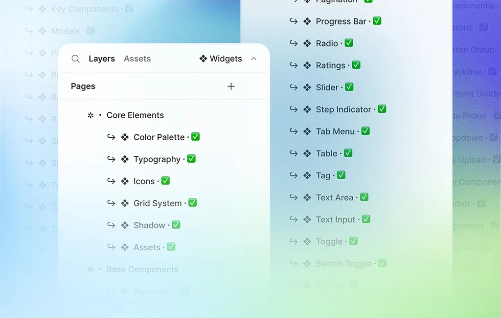
We present our newest update, brimming with an array of enhancements to take your design endeavors to the next level. Delve into the world of cutting-edge components like Dropdown, File Upload, Modals, Progress Bar, Radio, Ratings, Slider, and Tag.
Let's dive into the array of new components in our design system!
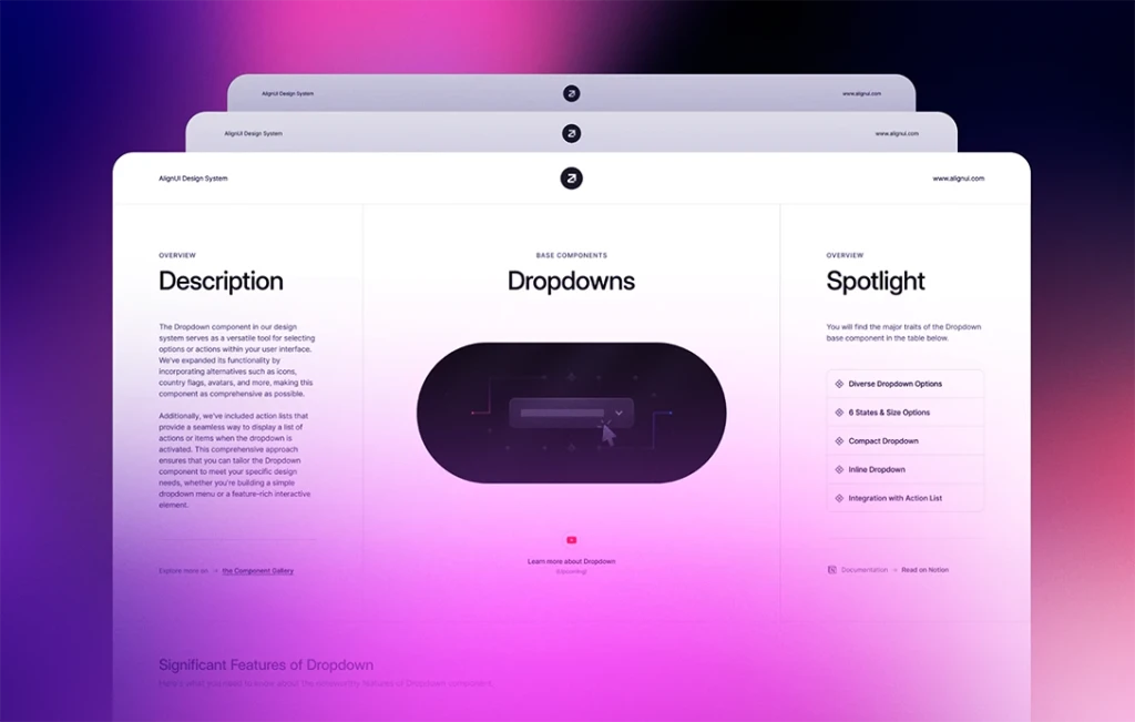
🔽 Dropdown (New)
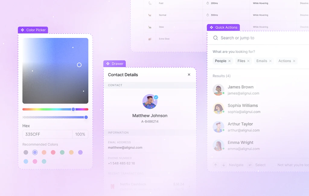
Discover our versatile dropdown component with various types, including default, country, user, card provider, and company. Explore the power of action list items within the dropdown, such as default, avatar, and company, available in small and medium sizes. Additionally, utilize search input, buttons, and content dividers as action list misc items to create seamless user experiences.
📂 File Upload (New)
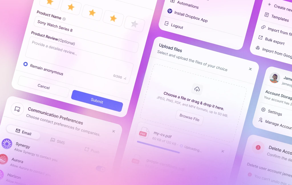
Simplify file uploading with our user-friendly file upload component, featuring a convenient drag & drop zone. Experience file uploading cards with states like uploading, completed, and failed, providing clear feedback to users. Access file format icons in 9 different colors to enhance visual appeal.
📑 Modals (New)
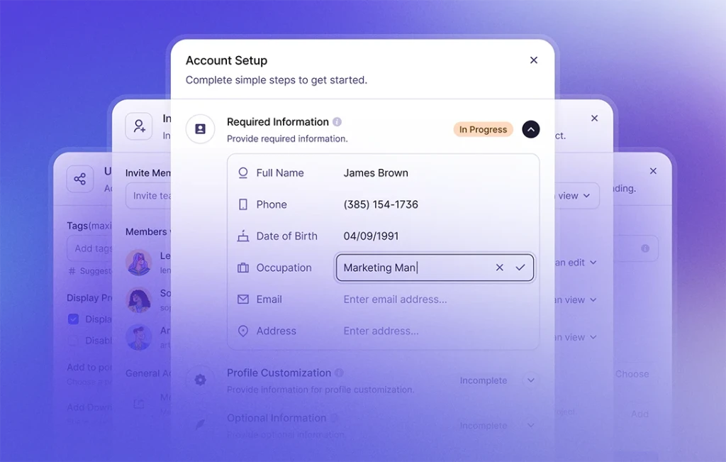
Elevate your design with our extensive modal components, offering default and status modal headers in small and medium sizes. Customize modal footers with button, double button, checkbox, step dot indicator, and link button options, all easily editable components. You can also implement your content between the header and footer as you wish. Moreover, benefit from status modals, including error, warning, information, and more, with easy alignment options and customization possibilities.
📊 Progress Bar (New)
Utilize our dynamic progress bar components with customizable colors and adjustable percentage indicators. Take advantage of progress bar labels to add link buttons, descriptions, and more for comprehensive user interaction.
📻 Radio (New)
Maximize user interactions with our completed radio button component, featuring hover, pressed, and disabled states. You can use radio labels with badges, descriptions, link buttons, and more to create engaging user experiences.
⭐ Ratings (New)
Experience our comprehensive rating components, offering star, heart, and circle rating types to suit your design preferences. We have also added Rating & Review cards enabling you to combine rating components with descriptions, and link buttons to showcase ratings and reviews in a visually appealing manner.
📶 Slider (New)
Explore our versatile slider and range slider components, allowing easy customization of ranges, also adding tooltips, sublabels, and more to deliver seamless data input and interaction.
🏷️ Tag (New)
Optimize content organization with our complete tag component, featuring left icons and dismiss icon on the right. Choose from stroke and gray background types, along with various states to suit your design needs.
Finally, let's get a sneak peek at our upcoming roadmap for the next update.
🚀 Next Update
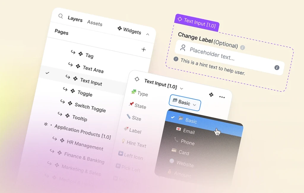
- Text Area
- Text Input
- Toggle
- Tooltip
Stay alert for these exhilarating enhancements and beyond, as we persistently strive to enrich and perfect our design system, empowering your creative visions.

