Introduction
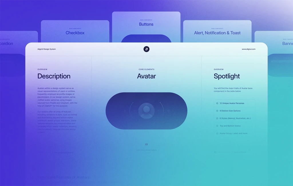
We are thrilled to present an array of new components designed to revolutionize your design journey. These exciting additions, from versatile Banners to customizable Checkboxes with labels, empower you to craft seamless user experiences. Moreover, Content Dividers offer flexible ways to organize content, while Date Pickers simplify date management with top selectors and time filters.
Firstly, we're excited to introduce six new components to supercharge your design experience. Let's dive into the details and discover the endless possibilities they bring to your projects.
🚩 Banner (New)
Choose from three different styles - filled, lighter, and stroke - to highlight essential information, features, or errors with our versatile Banners.
🥖 Breadcrumb (New)
Enjoy the flexibility of both icon and text variants, and select from three different divider options to create seamless navigation experiences.
🔘 Button Group (New)
Create sleek and minimalist interfaces with our Button Group, which supports up to 6 buttons. Additionally, you have the option to choose from the exclusively icon-based button group version for a streamlined look.
✅ Checkbox (New)
Checkbox component offers checked, unchecked, and indeterminate variants with various states. Add secondary texts for checkbox labels, and use small and medium versions with description and link button options. Badges can also be added for extra visual appeal.
Content Divider (New)
Organize content with finesse using our Content Divider, which offers a range of options, including Line Divider, Text Divider, Icon Button Divider, Icon Button Group Divider, Button Divider, and Button Group Divider.
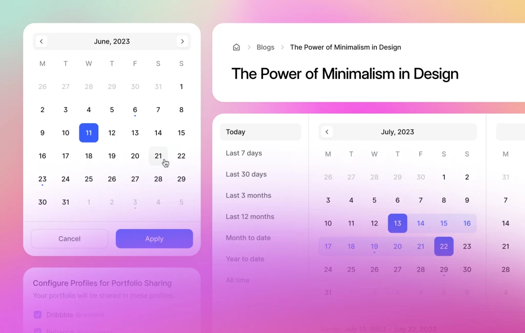
📅 Date Picker (New)
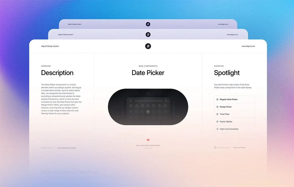
Effortlessly manage dates with our user-friendly Date Picker, offering both Default and Range versions. Experience smooth date selection with intuitive date selectors at the top and convenient time filters on the left, ensuring a delightful user experience.
Moving on, let's explore the updated components with improved ease of use and exciting new features.
🚨 Alert (Updated)
Experience enhanced user interactions with our updated Alert components, now available in three different styles - filled, lighter, and stroke.
🔗 Link Button (Updated)
Introducing a "modifiable" version, alongside the existing gray, black, and other options, complete with revised icons.
Lastly, let's take a glimpse into our upcoming plans and what you can expect in our next update.
🚀 Next Update
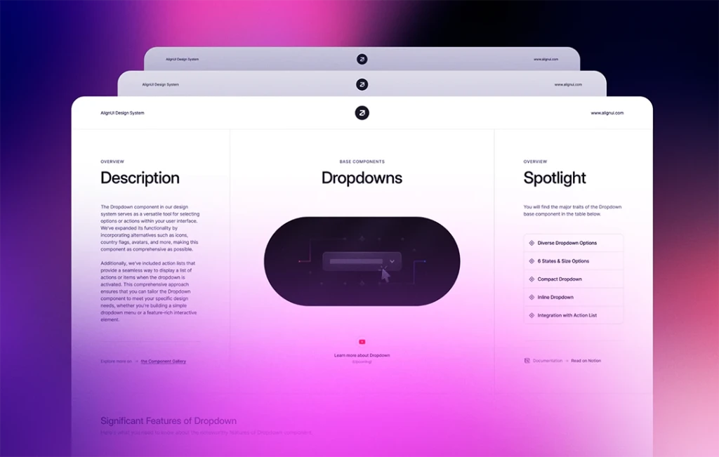
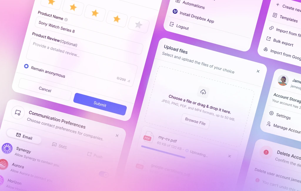
- Dropdown & Action Menu
- Feedback & Review
- File Upload
Keep an eye out for these exhilarating enhancements and beyond, as we persistently extend and perfect our design system to fuel your creative pursuits.

