Neutral Gray, Marketing & Sales Template, and AlignUI 1.1
AlignUI 1.1 marks our first major update since launching version 1.0, delivering a seamless integration between our Figma design file and React & TailwindCSS code library. We're excited to introduce the long-awaited Neutral Gray color palette, a powerful new Marketing & Sales template, and fresh components and enhancements driven directly by your feedback.
Let's see what's new!
What's new in version 1.1
Given the extensive updates, here's a clear overview of what we've added.
We've officially synchronized the AlignUI React code library with our Figma file, creating a pixel-perfect match between design and development:
- 40+ free components
- 100+ premium blocks
- Full TypeScript support
- Light & Dark mode compatibility
- Fully responsive & TailwindCSS-ready
You can click here to explore 40+ free components, here for premium blocks and templates, or here to see the full Figma file - all perfectly synchronized now!
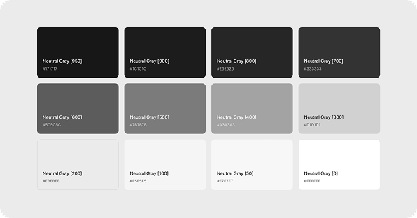
Neutral Gray joins our color palette as the new primary option, enhancing compatibility with Slate and improving overall contrast and depth in your designs.
- Neutral Gray introduced alongside Slate, now serving as primary.
- Overlay colors refined: Light: #333333 (32%), Dark: #333333 (56%)
- Placeholder Company logos updated from neutral-slate to neutral-gray palette.
We've expanded our design tokens with new corner radius and spacing options, making your designs more flexible, consistent, and efficient.
- Corner Radius Tokens: Added 0px, 2px, 28px
- Spacing Tokens: Added 24px, 32px, 40px
- Figma variable collections reorganized and renamed for clarity.
Icons & Typography
We've improved typography styles and settings across the system, enhancing readability, consistency, and visual comfort throughout your designs.
- +300 new icons (line & fill styles)
- Typography settings refined for clearer readability and consistency.
Select & Select Item moved to separate pages while Select Item has been renamed to Dropdown to improve component organization and usability.
- Quick Action → Command Menu
- Activity Feed → Notification Feed
- Toggle → Switch
- Switch Toggle → Segmented Control
Original Dropdown split into two components: Dropdown & Select
- Select & Select Item moved to separate pages
- Select Item renamed to Dropdown
Newly added components
We have added 4 new components. You can click the links below to review them
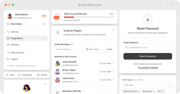
Multiple components have been upgraded with new blocks, clearer naming, and more reusable examples—streamlining your design workflow.
- Accordion: +4 new blocks
- Avatar: 4 examples converted into blocks
- Breadcrumb: +4 new blocks
- Button: 4 examples converted into blocks, plus 4 examples from TailInput added as blocks
- Checkbox: +7 new blocks
- Color Picker: +4 new blocks
- Date Picker: 1 example converted into a block, +2 new blocks
- Drawer: +8 new blocks
- Dropdown: 6 examples converted into blocks
- File Upload: +5 new blocks
- Filter: Added a 5-step subCategory filter block
- Modal: 2 examples converted into blocks
- Notification Feed: +4 new blocks
- Radio: 4 examples converted into blocks, +10 new blocks
- Select: 3 examples converted into blocks
- Toggle: +4 new blocks
- Toggle (renamed to Switch): 2 examples converted into blocks
- Tooltip: +4 new blocks
- Status Badge: Information status variant added
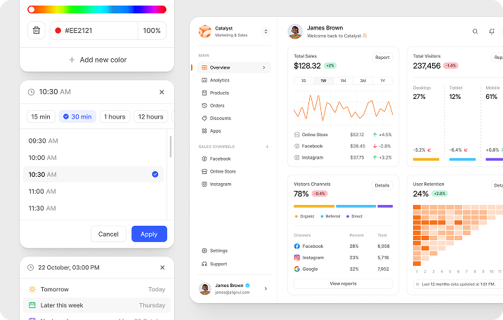
Marketing & Sales Template
We're officially launching the Marketing & Sales Template with this update—fully synchronized with our React code library. Crafted to accelerate your workflow, it includes:
- 15+ custom widgets to visualize key marketing and sales metrics.
- Dedicated pages for analytics, orders, and products.
- A detailed, 22-page settings section for comprehensive configuration.
- Complete authentication and onboarding flows.
- A multi-step product listing flow (General Info, Pricing, Images, Stock Stats).
- Carefully designed empty states for an optimized user experience.
Preview the Marketing & Sales template ->
Plans & Pricing
AlignUI 1.1 is available through flexible plans designed to fit your specific needs:
Figma File
Code Library
Figma File + Code Library
All plans include lifetime access and unlimited projects—giving you freedom and flexibility as you grow.
We're excited to see what you'll create next.
Thanks for designing with us. 🚀
Enjoy!

