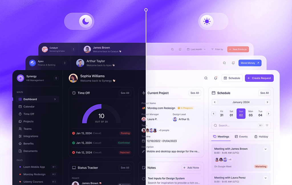
The AlignUI Design System has officially transitioned from BETA to Version 1.0, marking a significant milestone in its evolution. We are excited to announce the integration of the much-anticipated Dark Mode alongside Figma's newly introduced Variable feature, announced in Config 2023. This update brings forth numerous new colors, icons, and a plethora of fresh components.
Let's delve into what we've accomplished in the first major update of AlignUI 1.0.
What’s new in version 1.0
Given the multitude of enhancements, let's delve into a detailed overview with our first Changelog entry.
Ensure smooth collaboration between Dark Mode and Variable features, we've introduced numerous new colors. Additionally, based on the valuable feedback from our users, we've aligned the color tones to be compatible with Tailwind. We've expanded the Neutral color palette from 9 to 11 tones and increased the tonal variations of our vibrant colors from 5 to 11. Furthermore, we've entirely revamped the Teal color and introduced a new color palette named Sky.
Additionally, we've incorporated three different alpha variations for all colors, including Neutral.
Our typographies were already in good shape, requiring only minor adjustments. We've updated the letter spacing adjustments of the typographies and aligned them with geometric calculations provided by Rasmus, the creator of the Inter font.
Since the BETA launch, Remix Icon has provided nearly 3-4 significant updates. Keeping pace with these updates, we've added almost +400 new icons with line and fill styles. We've also reorganized a few icon names and made minor adjustments to their sizes.
Assets have been categorized and organized into pages for easier navigation and reduced clutter. We've added Dropbox and Webflow logos under the Major Brand category. Additionally, we've adjusted the branding color of the Telegram logo.
Motion & Animation and Corner Radius guidelines have found their place within the Figma file. This allows you to maintain a consistent look by adhering to predefined speed durations and radius values when prototyping any component.
We've introduced several new components:
- Activity Feed
- Quick Actions
- Drawer
- Filter
- Color Picker
- Popover
In addition to these newly added components, we've also made improvements to existing ones.
Now, let's delve into a more detailed examination:
- Effects on text and icon variants in the Avatar component have been removed.
- The content of the Illustration variant in the Avatar component has been converted from SVG to PNG format to facilitate sharing within the Figma community.
- Updates have been made to text, icon, and button colors in the Banner component to ensure smooth operation in Dark Mode.
- A new variant called Lighter has been added to the Badge component. Padding and spacing have been adjusted, and colors have been optimized for Dark Mode.
- GitHub and Dropbox login buttons have been added to the Social Button component. Branding colors of companies like Apple, Twitter (X), and GitHub have been integrated into the Variable system for seamless operation in Dark Mode.
- The Purple variant has been removed from the Fancy Button component, and its colors have been integrated into the Primary color scheme for better consistency across theme changes. Additionally, the Focus state has been removed.
- Padding adjustments have been made to the Button component.
- A new size, 2X Small (28px), has been added to the Button component.
- A 6-item variant has been added to the Button Group component.
- Extra effects on Checkbox, Radio, and Toggle components have been removed for a cleaner appearance.
- Avatar, Country, Brand, and Company variants have been added to the Tag component.
Furthermore, in the upcoming months, we'll be unveiling Marketing & Sales and other sector-specific dashboards with new updates. While the Marketing dashboard is nearly complete, we're still working on its subpages. Regrettably, we couldn't include them in this update, but we're committed to delivering them in the next.
That concludes the Changelog for AlignUI Version 1.0.
Here's to great pixels!


